HumHum Slackbot For Food Ordering
Slackbot helping you to create, share and split the expenses
between co-workers - UX case study.
The Brief
Food is meant to be shared. Whether it’s with family, friends, or colleagues, there’s nothing better than sitting around a table and enjoying a meal together. If you are in a startup or mid-level company or even enterprise for sure you are living a daily behavior, not the stand-up meeting or reviewing your calendar, but you are ordering food every day with your colleagues. This thing looking be cool for some people and for others frustrating, And from here the problem comes.
The Problem
Having lunch with your colleagues in one table is something really good for the company culture and environment, but ordering the food in a group is a frustrating process and headache for others especially if you are the person who is collecting and requesting the order from restaurant, Or maybe the worst, you will be the order victim (The man who's paying the total amount till splitting the bill/expenses).
It's a hassle for me and for any of my colleagues, the question is why I spend around 15-30 minutes to satisfies a simple need every day on Breakfast & lunch. This a huge problem and common in every company. I need to make this experience from a frustrating stage and everyone escapes from it to an enjoyable experience.
"Problems should be seen as opportunities, especially in the design world, since solving them is actually our core mission"
- From - Ioana Adriana Teleanu
Today’s Solution
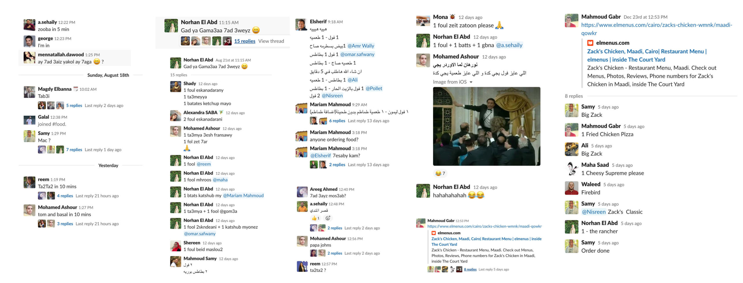
Slack, everyone in the company when he feeling hungry he opens directly his slack account to see what orders are still open or placing a new order in the food channel. Why Slack! Because every company has a slack that has a food or lunch channel for sure that makes the treads relevant and in one place and not disturb the others. We using slack to notify each other with our orders, making a group order and splitting the expenses.
"Food brings people together. If you or a workspace member bring treats to share, people will gather together and share a bite, even if just for a few short minutes. Food can help create interactions and engagement within members, and when it comes to them hosting work meetings in your space, it can help them close business deals or sign a new client"
- From Can Catering Food Help You Boost Workspace Member Engagement?
Observation
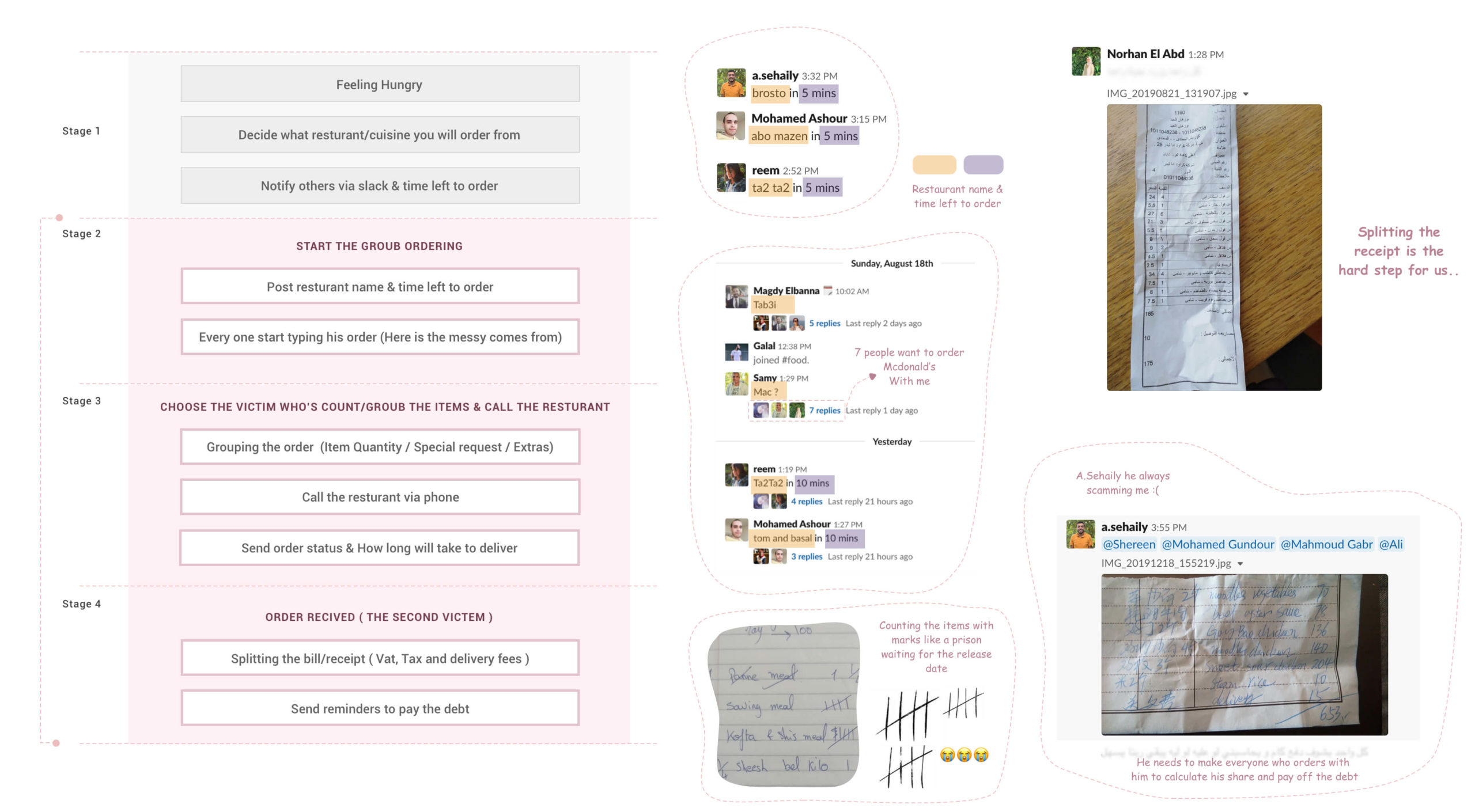
My direction was to observe my colleagues' discussions when someone placing/sharing a new order and split the bill/expenses on the channel. The experience is still cool but it needs a sort of management and Improvement. They start using the channel in the morning for breakfast and at noon for lunch most of the time. They are placing the restaurant name and time left to order/call the restaurant.
- The order most of the cases contain 4 or 5 unique items.
- They are picking from those items and barely someone adding a new one.
- They are gathering the orders quantities by pen & paper.
- They are splitting the receipt manually: (Vat + Tax + other expenses) divided among the number of people plus his item price
User Stories
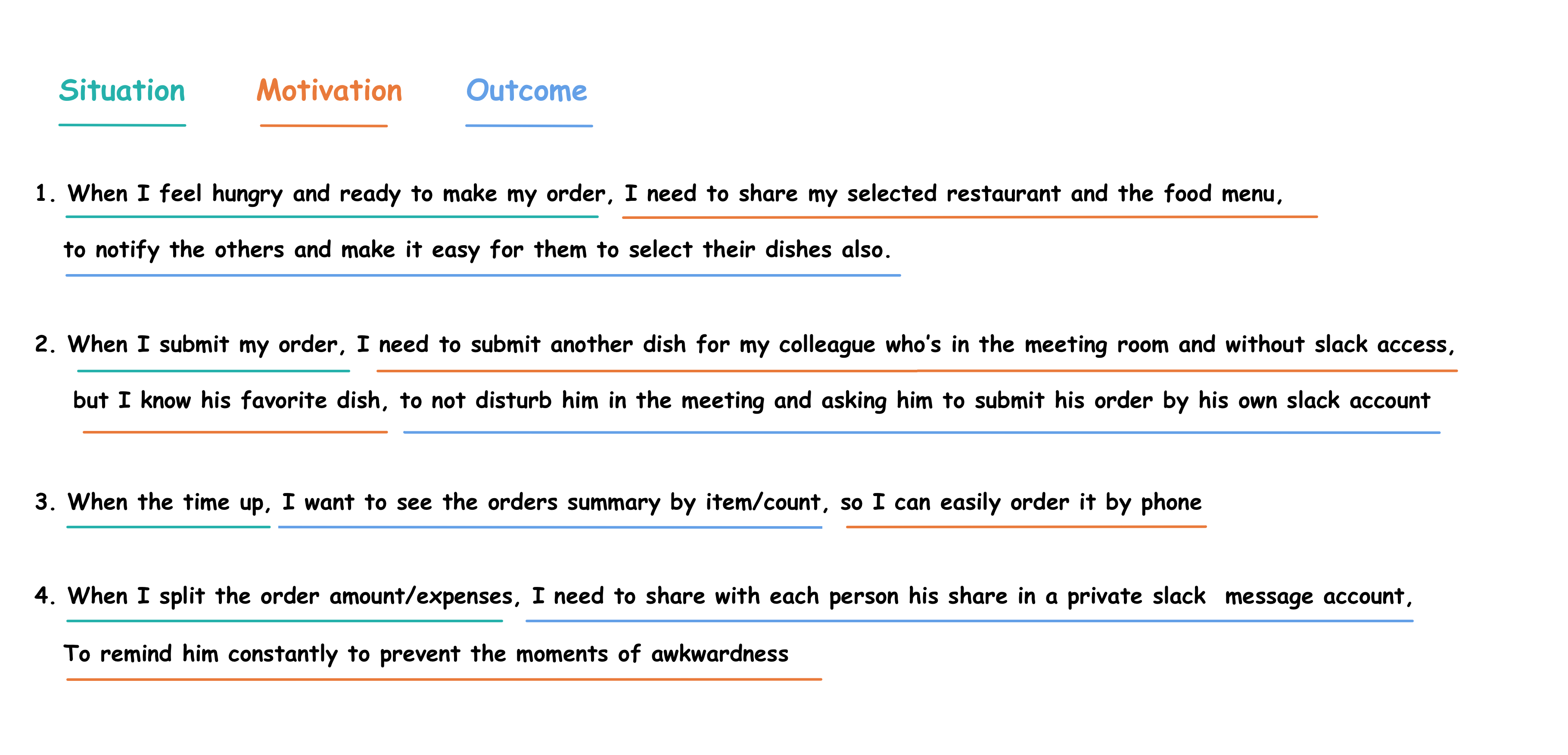
I used the Jobs To Be Done framework to explore different contexts in which a user would use my solution and understand their motivation and desired outcome. Job Stories are great because it makes you think about motivation and context and de-emphasizes adding any particular implementation.
Identifying / Prioritising Pain Points
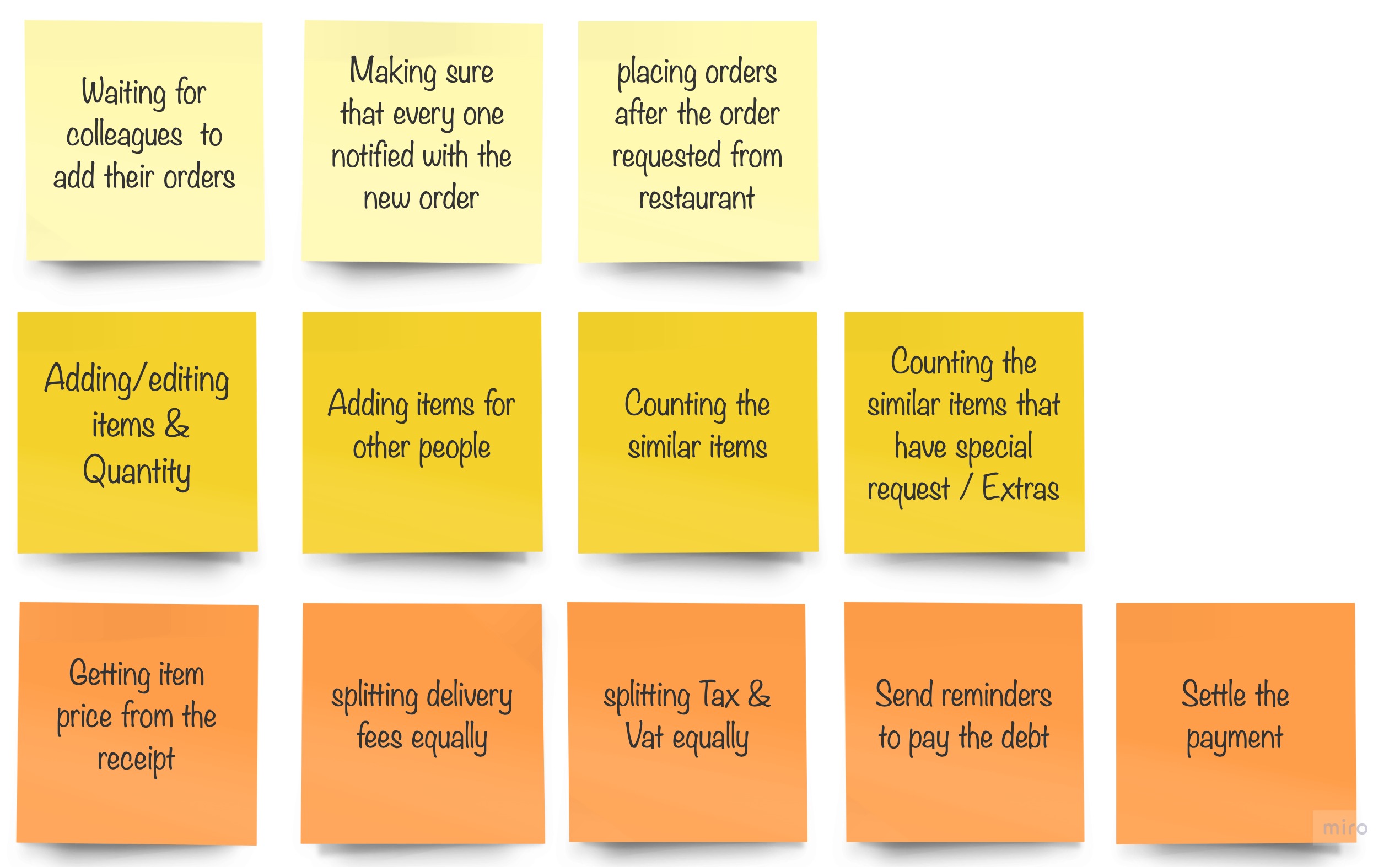
I use Affinity Map, I put some assumptions based on the screenshots and what actually happens in the real world between me and my colleagues and laid out the problems and complaints that each user had. I then used affinity mapping to organize and group these pain-points into categories.
1- Painpoints during the placing the orders
2- Painpoints during collecting and placing each one order
3- Painpoints during the splitting the receipt process ( Item name, Vat, Tax and delivery fees )
Suggested Solution & Diving into Slackbot experience
My goal is so simple as I'm the foody guy in the company and everyone comes to me when he/she feels hungry, I need an enjoyable and efficient way to notify the others with orders and make the placing and choosing dishes, get order summary, request the order from the restaurant and finally splitting the bill amount/expenses process is super easy.
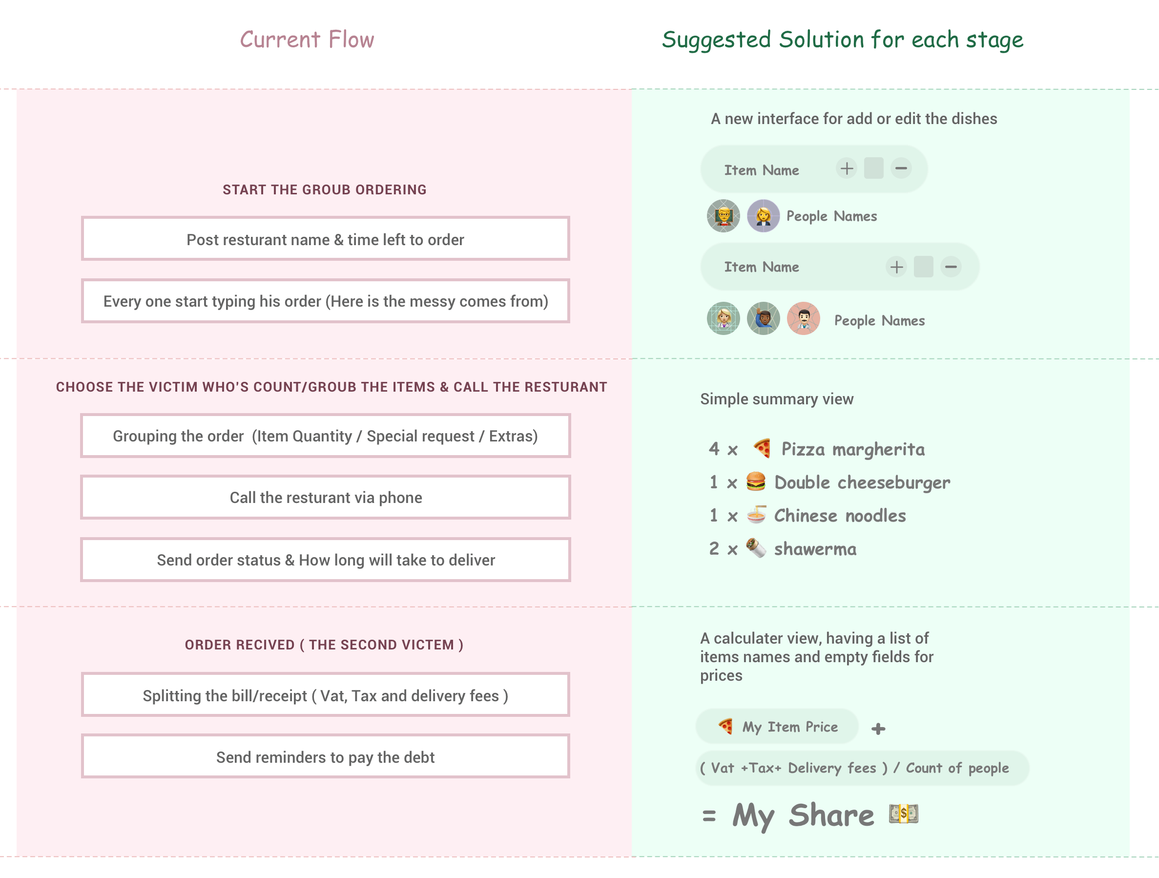
Like I said before the experience already exists but it needs a sort of management and Improvement. So my suggested solution is creating a Slackbot that has the ability to handle all this hassle and make the whole experience from gathering the order to splitting the receipt much easier. in other words, we will keep the whole experience in the Slack food channel because there is no need for a new app or getting into a new hassle, everyone has a slack app on his computer and his phone. The bot will help me mainly to manage the biggest problem that I have:
- Gathering/collect the order problem.
- Splitting the receipt and send notifications to pay the debt problem.

Who's in the market / Learn from competitors
There is no need to reinvent the wheel from the beginning but if the wheel didn't satisfy the required speed you should build a new one with your enhancement and improvement.
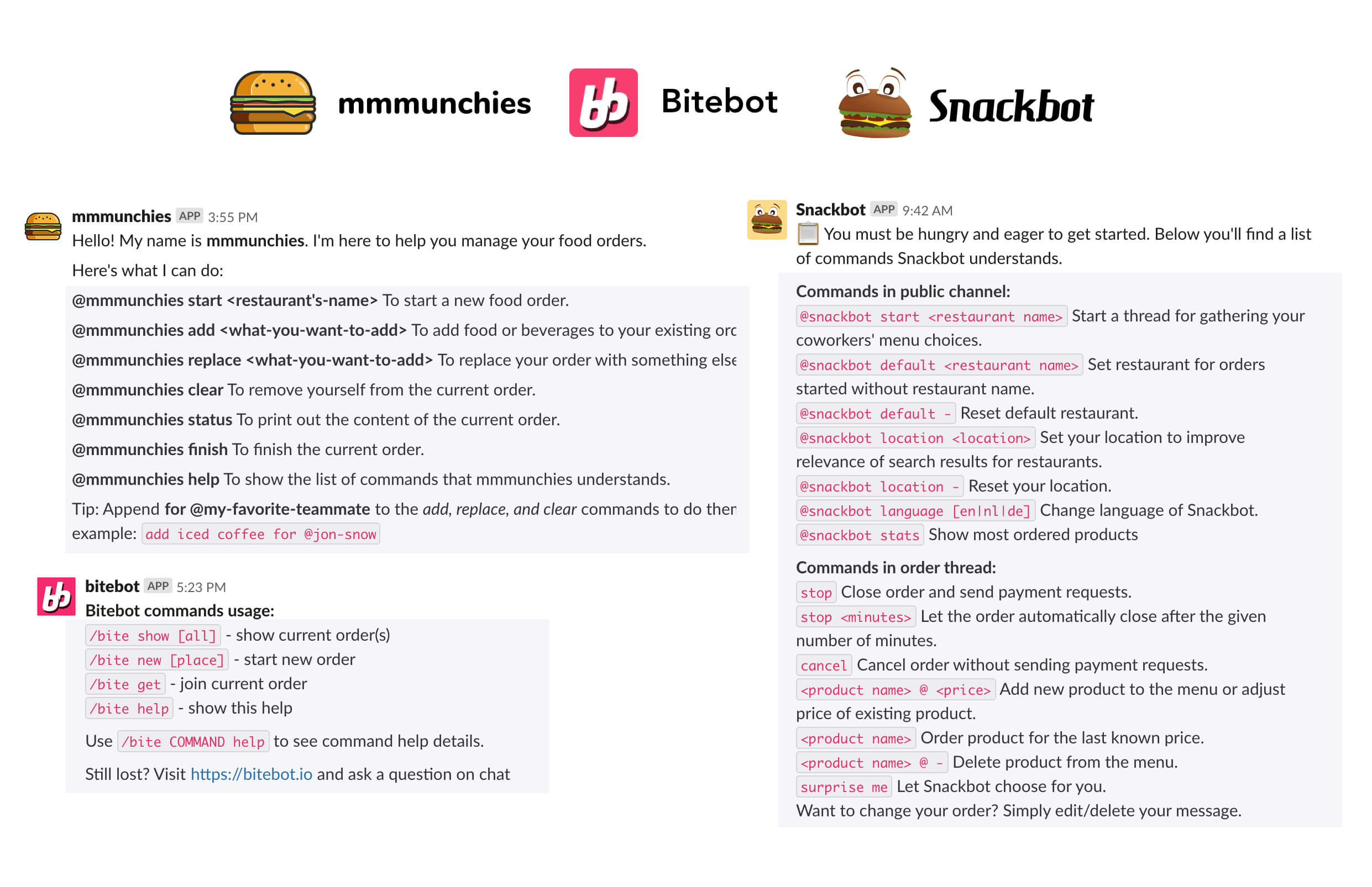
I started to look for every bot in the Slack app store that can do and satisfy my need especially on gathering orders and splitting the bill. I find pretty good bots like ( mmmunchies, Bitebot and Snackbot ) but unfortunately, each bot has strengths and weaknesses that relative to what I need but at least I got a good some new ideas and filled up my inspiration inventory.
Competitive Analysis is often used to highlight strengths and weaknesses of products in order to make more informed decisions about your product strategy. -- brad dalrymple
Some of main food ordering bots in the slack app store mmmunchies, Bitebot and snackbot
Ideation & Brainstorming
As it always goes, to design a solution, you need to understand the needs first and break the journey into smaller parts, then analyze each one of them. I starting to break down all the features and I think in this phase the things starting showing up and having a clear vision of what actually I want to do or build.
Sketching, Sketching, and Sketching
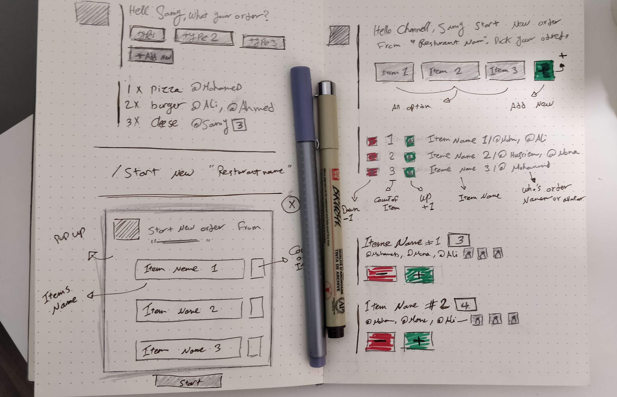
As sketching first is always a winner, I started sketching on my sketchbook and inspired by dribble and some shots on Instagram to get the main structure & idea of the design.
However, to design a bot inside Slack App you need to follow the design guidelines. there is a Slack block kit which is a UI framework that offers a balance of control and flexibility when building experiences in messages and other surfaces using very good documentation on Building blocks & Interactivity in blocks.
High-fidelity & ignoring wireframes
Honestly, I'm not a big fan of wireframe or mid-fidelity design, I always feel that it is a wasting of my time for a simple reason and it is the Limitation of visualization. I agree with you if you will use the wireframe to validating or maybe just give the client or the stakeholder an idea about what your thoughts, but in my case, I really don't need it if I already have what I need to do in my mind and ready to apply some colors and interactions.
Step #1
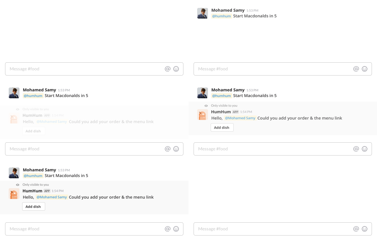
Start new order & Add your choices with the menu link
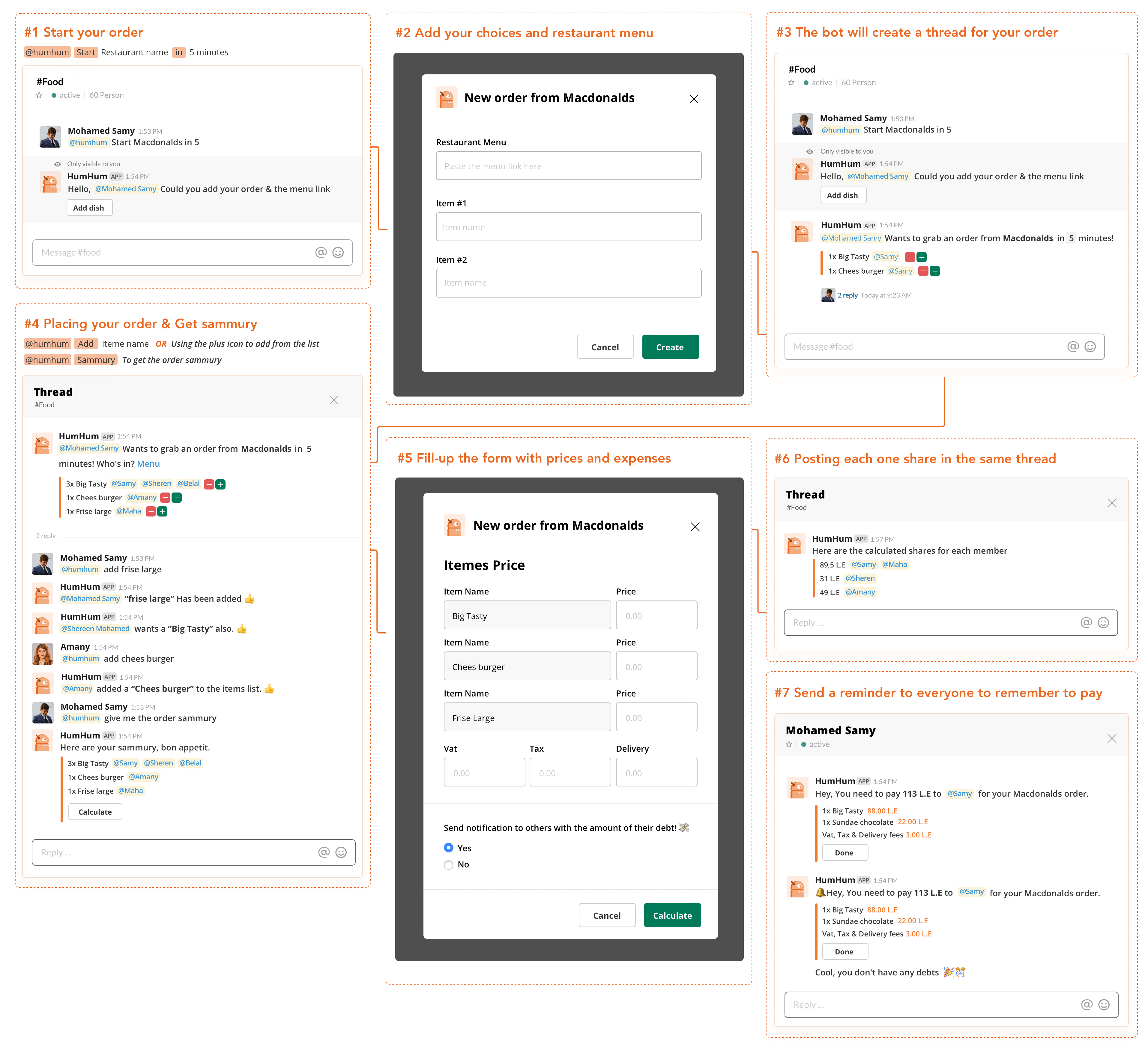
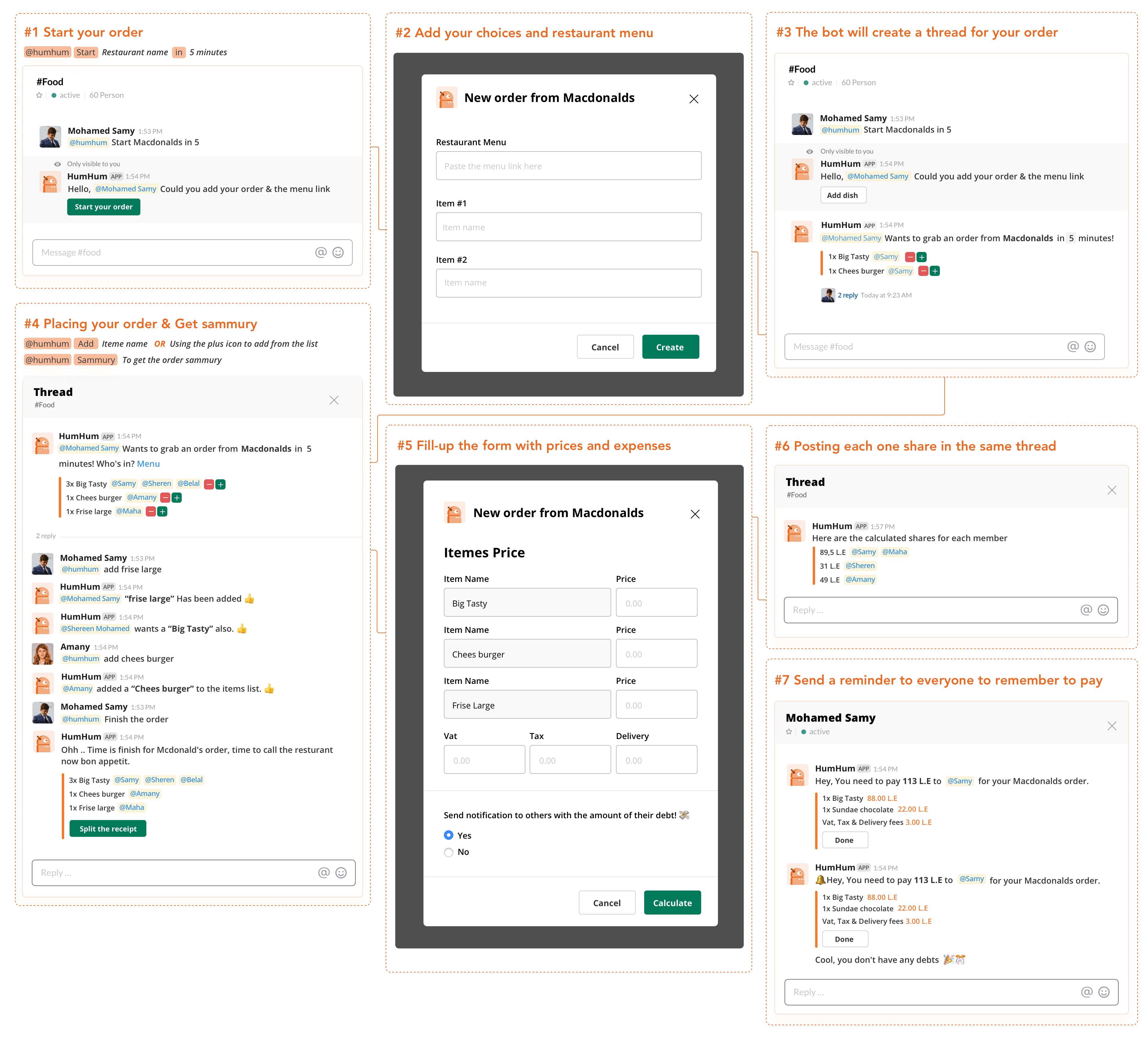
For starting a new order you need to just mention the bot name and type the "Start" word followed by the "restaurant name" and for defining how much time you will need to close the order in minutes. you need to type "in" followed by any number of minutes you need. Ex: @hummhumm start Macdonalds in 5
The bot will send you a message visible to you only to reduce the number of messages in the channel. The reply will be a confirmation and add dish button to placing your item's names and menu link if it is available.
- Use the "Start" followed by "RestaurantName" to start a new order.
- Add "in" followed by "Number" to define how much time you will need to close the order in minutes.
Step #2
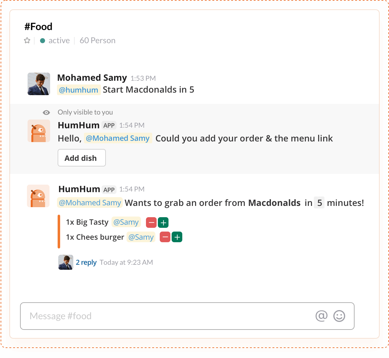
Placing your order / Select from the items list
After you create the order the bot will confirm your items and your name in a block. Also, I added a minus and plus buttons to give the user more accessibility to say -I want also the same dish- or move back and delete his own dishes or items.
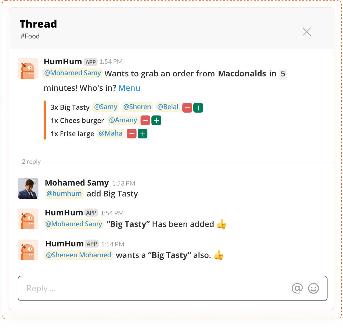
At the moment that you created the order, a new thread has been created to enable the users to add different items that not existing in the main list by mention the bot name and type the "Add" word followed by the "Item/dish name" and the bot will add the new item in the same block that created before in the channel.
Ex @hummhumm Add Cheeseburger.
- Use the "Add" followed by the "Dish name" to add a new item or dish that does not exist in the item list.
Step #3
Splitting the receipt & send a notification with the dept amount
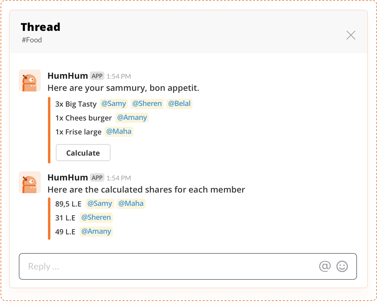
After gathering the whole order items, It's time to get order summary by mention the bot name and type the "order summary". The bot will give you a nice looking block with clearly items name and their counts and the people who are ordered. Also, at the bottom of the block, the bot will give you a calculated option to start splitting the receipt.
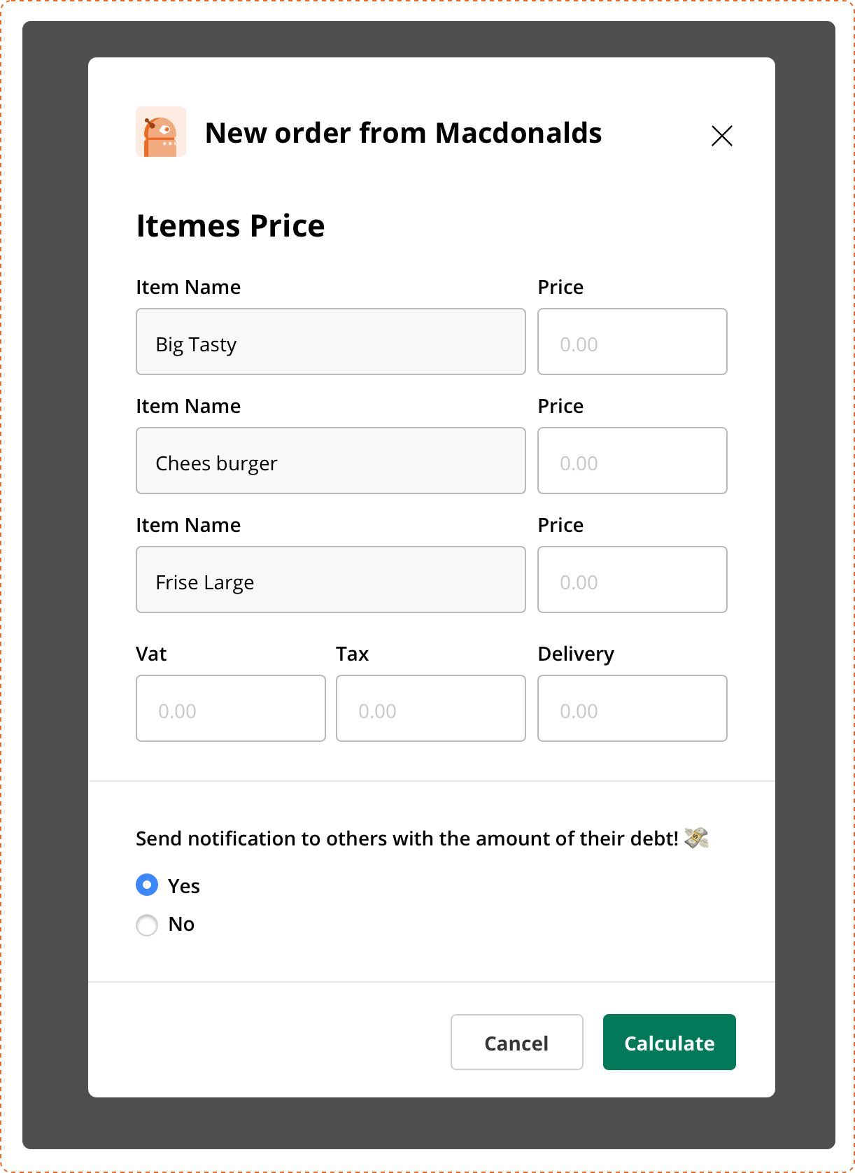
The calculate modal view has the whole item's name and you will need each item price from the receipt. You will have extra inputs for how much you paid for Vat, Tax and delivery fees or other expenses that it needs to split it with the users.
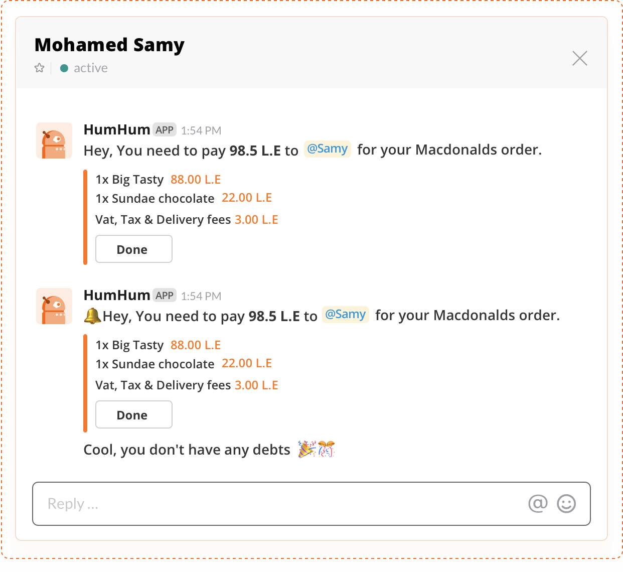
The notification option is a way important because it allows sending a notification for each user in the group order with the debt amount and this notification can be repeated every 1 hour until the user press "Done" or in the other word, the debt was paid off
Quick and dirty usability test
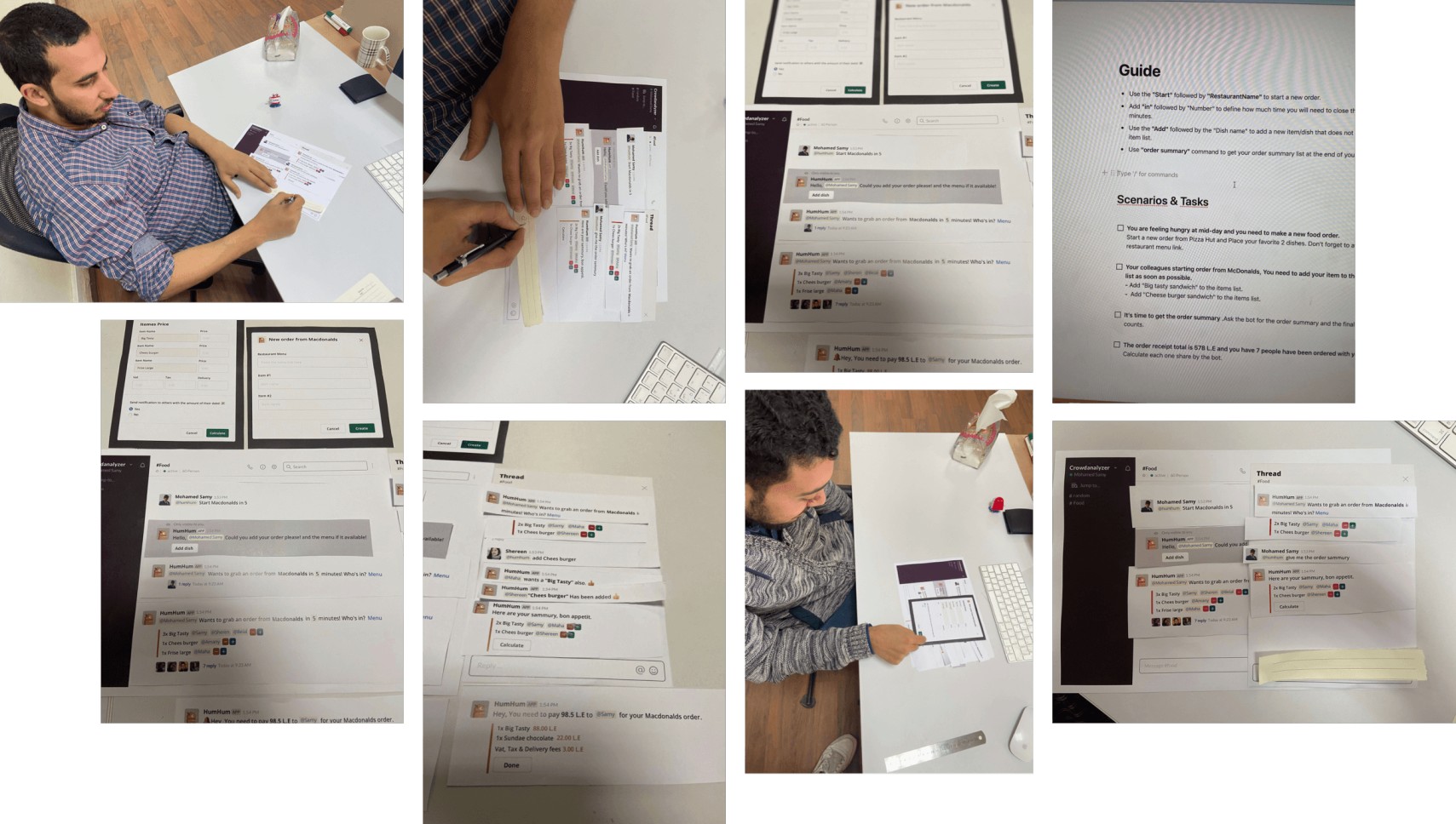
This is a user-centered design. So to ensure that my product did exactly that, I need to do some validation and make sure that my solution is easy to understand. So, After define some test parameters. Users were asked to perform the following tasks after I gave them pre-defined scenarios:
What: Slackbot paper prototype.
Where: the fun area of Crowdanalyzer Head office.
How: Guerrilla usability testing.
Scenarios & Tasks:
- You are feeling hungry at mid-day and you need to make a new food order.
-- Start a new order from Macdonalds and Place your favorite 2 dishes.
-- Attach the restaurant menu link. - Your colleagues starting order from Mcdonalds, You need to add your item to the items list.
-- Add "Big tasty sandwich" to the items list
-- Add "Cheeseburger sandwich" to the items list. - It's time to get the order summary from the restaurant
-- Ask the bot for the order summary. - The order receipt total is 578 L.E and you have 7 people have been ordered with you
-- Calculate each one share by the bot.
User Feedback & Some Common Findings
Honestly, the user feedback was very valuable for me and after conducting usability tests with 4 people in my office, The results were great. the users almost completed all the tasks successfully and with nice feedback and impressive impression.
4/5 users passed their first task successfully and they started their orders with 2 items.
5/5 users placed their orders by the plus icon and "Add" command.
4/5 users get their order summary.
5/5 users start calculated/splitting the order with the bot in a very easy way.
At the same time, I find 2 different tasks that the user didn't sure the correct way to finish. I take my process very seriously actually when it comes to user-centered design, so I need to design something more clear and think about a more easier way to go over these failds. it's so simple, ( Design-->Validate ) and repeat it a couple of times till you have a good experience.
Starting the order CTA
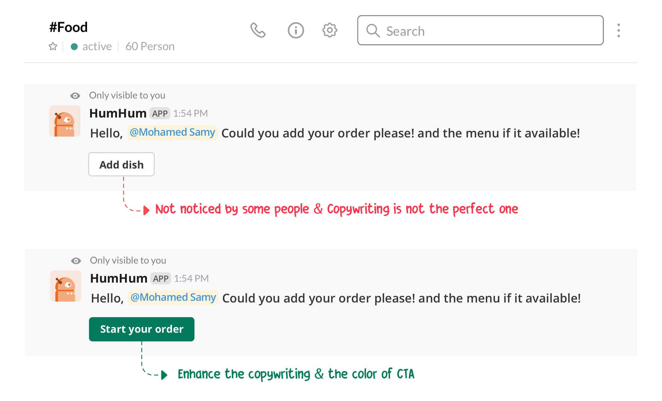
"Should I use the "@humhum add" command now or what! How I add the items "
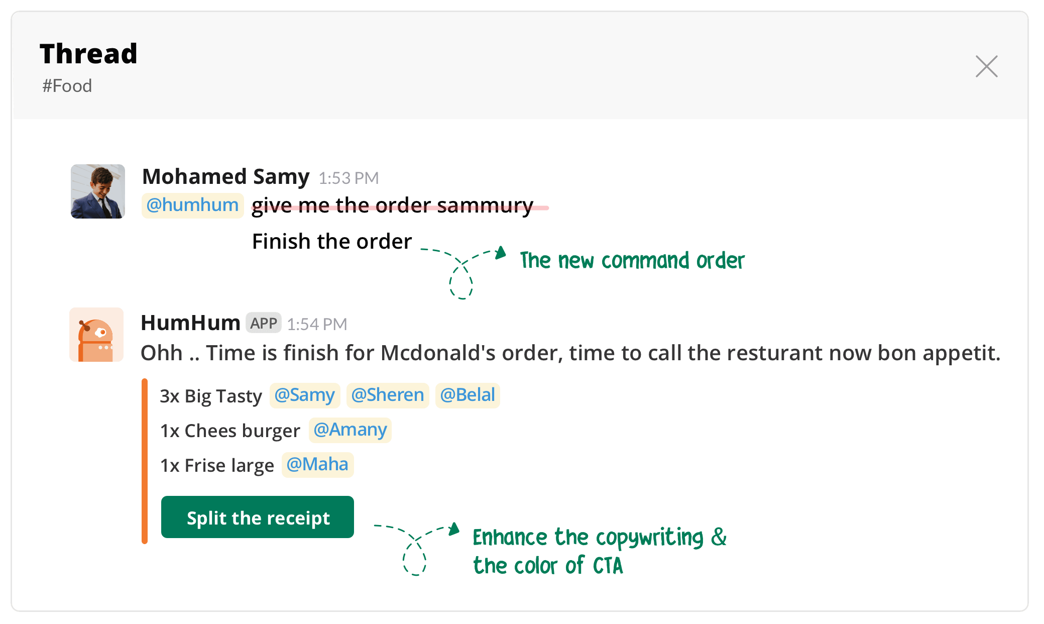
The user was not sure how he can add the items, or in other words, he didn't see the button. So, I did a small change in the CTA color and the also change the label to "Start your order"
No more placing orders & show summary plus calculator CTA
"The summary view or items quantity is already existed, I can use the header of thread as a sammury, But I need to stop placing orders"
One of the users saw the summary view does not make sense for him especially the view is the same existed in the thread header. but he needs another action to prevent the people to place their order ( waiting time is finished ) . So, I replaced "order sammury"
command with "Finish" command
Final Design
Overall, this solution and the design might be a quick fix and would need some further research and testing to be done in order to find a truly great solution that works even more seamlessly, especially in the corporates life and might be super cool with some kind of online food ordering API (items & prices), and adding extra features like automatic placing order.
The whole design is based on Slack design guidelines. This guide contains a non-exhaustive series of tips and best practices to keep in mind when composing the app surfaces.
Conclusion
Again, food is meant to be shared. Whether it’s with family, friends, or colleagues, there’s nothing better than sitting around a table and enjoying a meal together.
Implementing the above design could particularly improve the user experience in a group order. I love my beloved company "Crowdanalyzer", and I love UX. I just wanted to see if I could help make it more fun and intuitive to use than it already is!

