Revamping Ride-Sharing App Experience
Redesign a ride-sharing app experience for a Saudi startup evolves the way that
the world moves - UX case study.
The Story -- From a corporate to a small startup
I was hired as a full-time by a startup located in Saudi Arabia from 2 years ago to redesign their app. they have a ride-sharing app called previously “Easy Trip”. literally It was a very bad example of UI and UX. At this time I was a UX designer in Vodafone Egypt, and many people were worried about this switch - From a multinational company to a very small startup in Saudi Arabia - but the challenge was very catchy for me, and I accept it.
So, my main task was to bring them to live again in the market and rebuild the user experience with a new design that fits their new identity & brand, I might not be able to cover everything here but I’ll share what I have so far.
The Challenge
The main issue is that our society requires a large number of people to move around at the same time. People have to travel to and from work and school, run errands, and shop during business hours. These simple facts aren’t going to change, Right? What needs to happen is for people to have practical, efficient, and accessible alternatives that rival the convenience of hopping in their cars and driving on their own.
Besides, during my contract period in Saudi Arabia, the women weren't allow to drive their own cars and they must hire a personal driver, but on last September 2017, King Salman issued a statement recognizing the right of Saudi women to drive in keeping with Sharia. also, I found an interesting fact in this time that Saudi Arabia has a significant interest in Uber’s future success; the country’s sovereign wealth fund invested $3.5 billion in the ride-hailing app last year.
"Saudi Arabia is the only country in the world that doesn’t allow women to drive, women were reliant on chauffeurs to get around. It isn’t uncommon for Saudi women to spend a third of their monthly income to employ and house personal drivers. The emergence of Uber in the country significantly reduced those costs. Ride-hailing apps, including Uber and its regional rival Careem, have offered women in the conservative country more freedom of movement, giving them the chance to participate more deeply in the workforce, which has been a recent goal of the Saudi government."
- Qouted from "Quartz"
The Process
"Change is not an event, it’s a process" - "Taras Bakusevych"
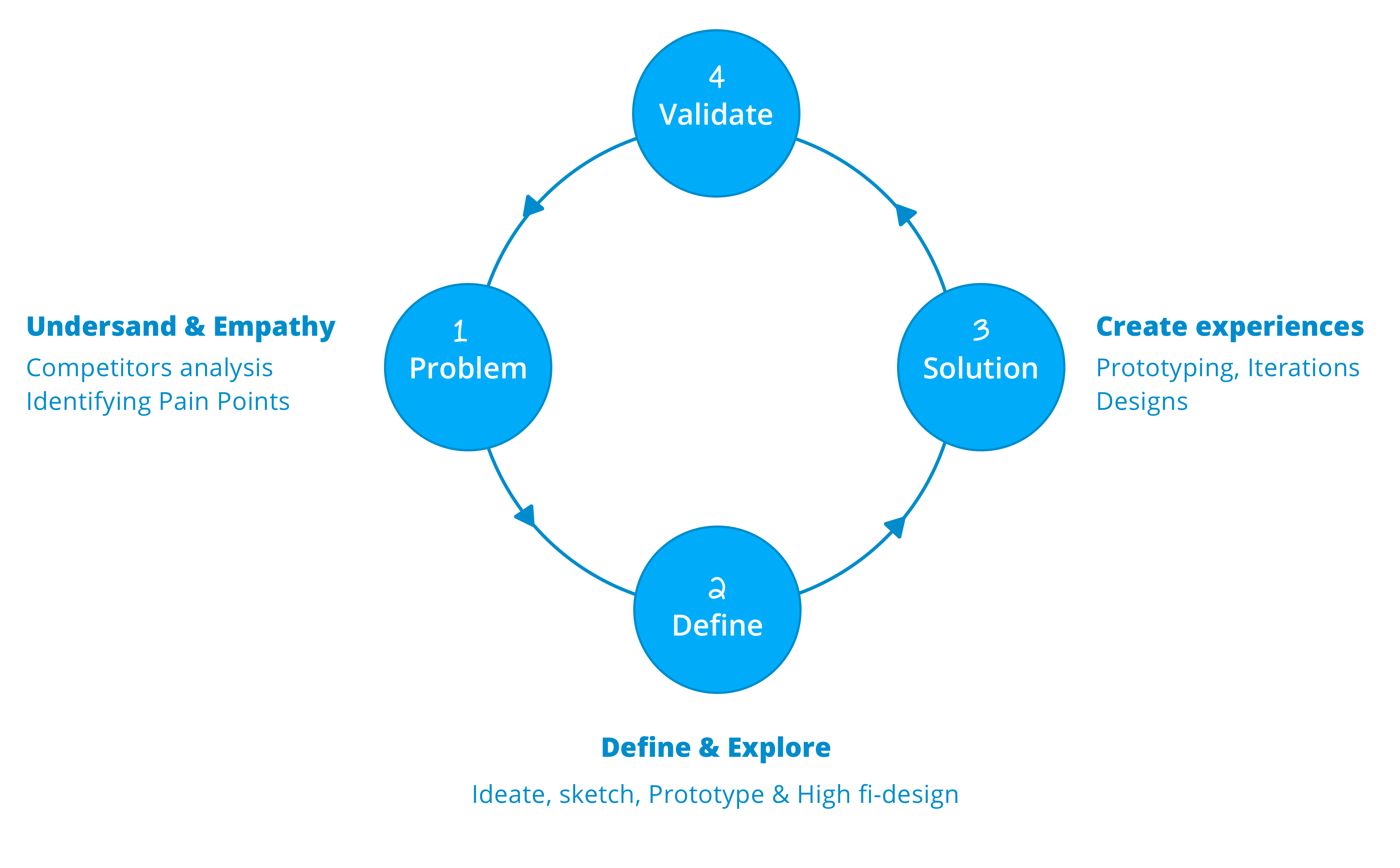
In the "How to redesign, step by step guide" article By Taras Bakusevych said that - the change is not an event, It's a process - I took these words as guidelines and as a concepet in this project.
Taras mentions that It is necessary to have a design process to follow. If the results are not satisfactory, we can go back and analyze what you did wrong and improve the process. If you did things randomly, you would always get random results.
Understand where you stand
In my first month in the company, I put myself in the exploration mode. No need for planning meetings or putting a tasks to follow, Only discovering and exploring more about the app behavior and the target audience who's actually using the app. So, I split this step into 2 small things:
1- Explore the pain points of the existing experience.
2 - Review the competition in the city.
Explore the pain points of the existing experience based on observations
and feedback of the users.
The main challenge was knowing more about the users, their pain points and what areas of the product need more attention, But with a small team ( 2 designers including me ) and without any analysis tool -They had only the iOS version, and it was most of the cases running with bugs- I decide to take the more cheapest methodology to grab some qualitative data, Observations & user Interviews It will provide much richer data about the users and their behaviors.
As Captain/Driver: I was requesting rides to/from home every day sitting next to the captain and writing his quotes and notes. Back to the office, I began analyzing all the notes and quotes with initial UX mapping to get the captain's pain points and goals.
As Rider/Client: I invited some people to our main office -who's not technically savvy- and gave them small tasks like (Request ride, Getting a piece of info from their previous trip that hey already had, Rating the driver), Then gathering all the feedback and thoughts from them and bring them to sticky notes to start my UX map
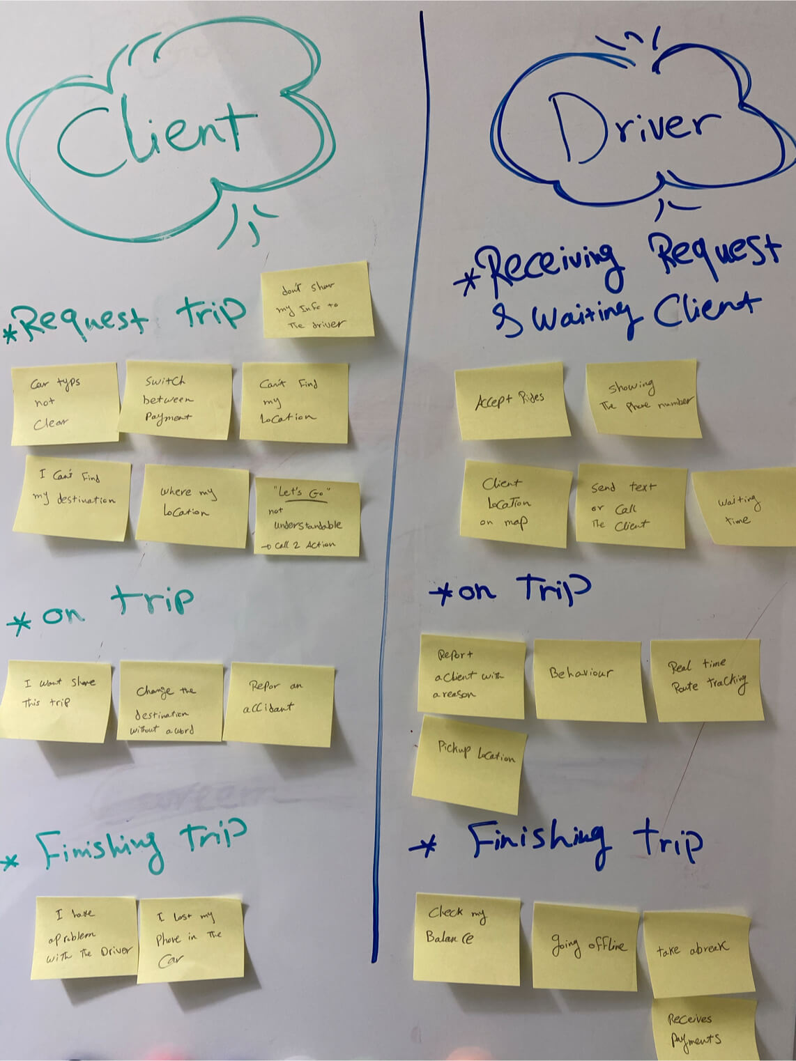
Some notes of pain points/thoughts of the driver & rider
Review the competitions in the city.
The market like the boxing ring, you need to know more about your weakness and strong points to have a good fight and win with a good share of the market, to figure out if there any gaps between you and them, How advanced their features are comparing it to your features. This review might be will give you a high-level overview of where you stand.
I downloaded the most popular apps in the city and start to discover each one of them, they were Uber App, Careem App -sold to Uber for 3.1 billion, two years later- and Easy Taxi App
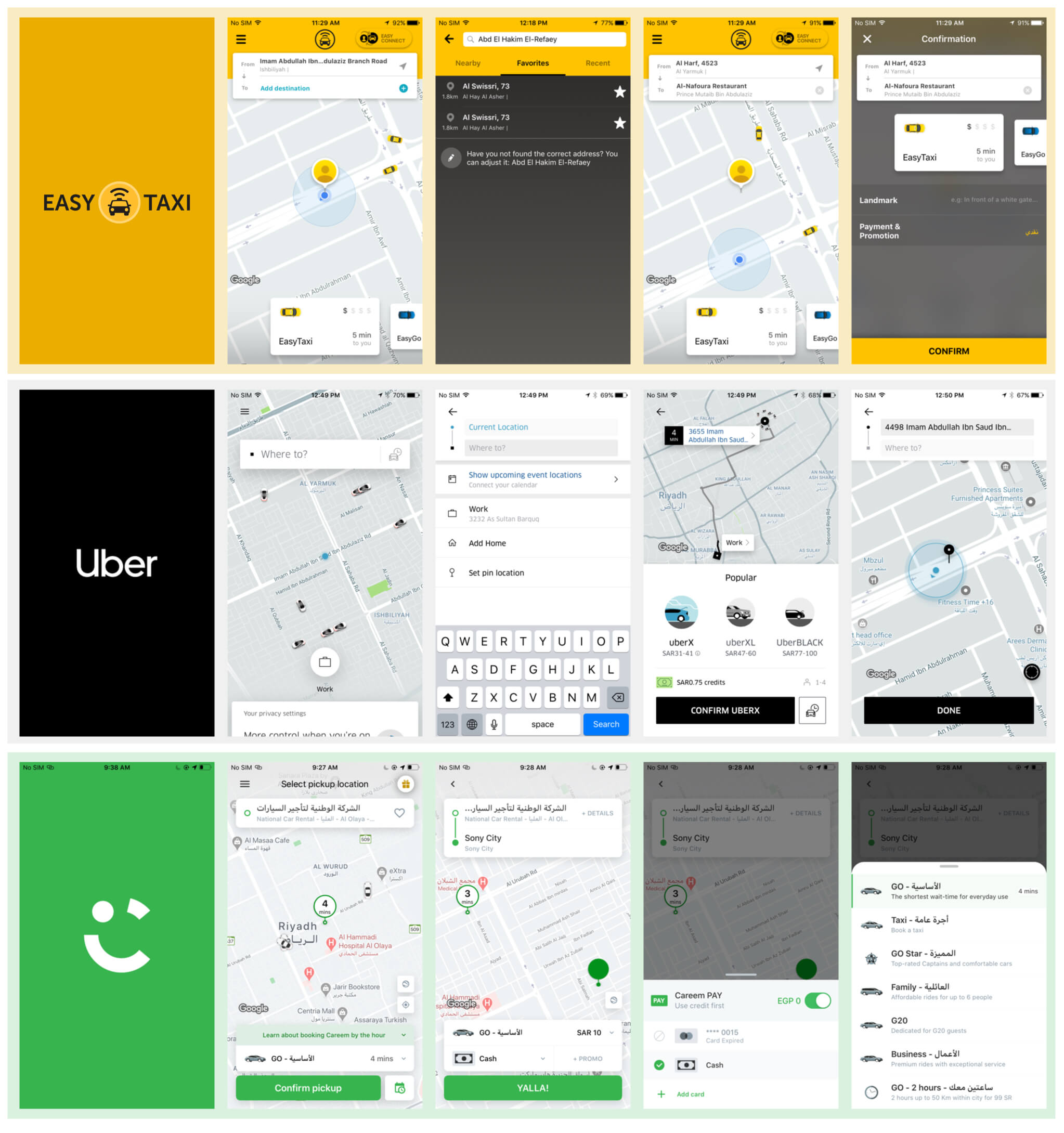
Some screens of the main competitors ( Uber, Careem and Easytaxi )
Design Requirements
Thinking about what a rider/user would need during different cases, we came up with some design requirements that we need to be added value to our design process. we use these requirements as our guiding principles as we moved onto brainstorming.
We make it simple
Simple sleek design aiming to simplify the experience of ride requesting or incoming requests for the driver. And we should consider how much data to display on both sides.
We care about the safety
Safety comes first, So before the user steps a foot in one of our cars, We need to provide a full details about the driver, car, and the rating.
We pay attention to the details
We know the daily routine and the places that the users head to on a daily basis. We should find the touchpoints that are effective in this routine and working on it.
We make it crystal clear
there's not eniugh user education for both riders and drivers. Therfore, we need to consider how much data to display on both sides
Identify The Common Problem Areas
before traveling to Saudia Arabia, I was decided not to revamp the whole app from scratch and put the current experience in my mind to take it as a base. Designing from scratch is preferable in particular cases but later on, I discovered that my case not one of them. There was probably a ton of thinking and research that went into the creation of the original solution and experience.
My goal is to understand how the product works and the intention behind each decision, So I decided to make a heuristic evaluation with my self to identify the general pain point of the app, It's helped me to discover the story of how a user might experience the product from start to finish.
- A complex process of request a ride
the process of requesting a ride was very frustrated for the user, It was like a checklist and you need to complete all the 3 steps to request a driver. The process was very hard for the user to understand. - Wrong use of colors and the call to action buttons.
There is no indicator for the loading states or error states in the app!! Weird? - Poor representation of the selected option.
The contacts between the colors on selected and empty states were so odd for the app, I was confused about what should I do and what I shouldn't when select options. - No transparency about price or estimated time of arrival.
The app broke most of the design principles, But the most one was there is no transparency about the estimated cost of the trip or the time of arrival witch I found so annoying thing.
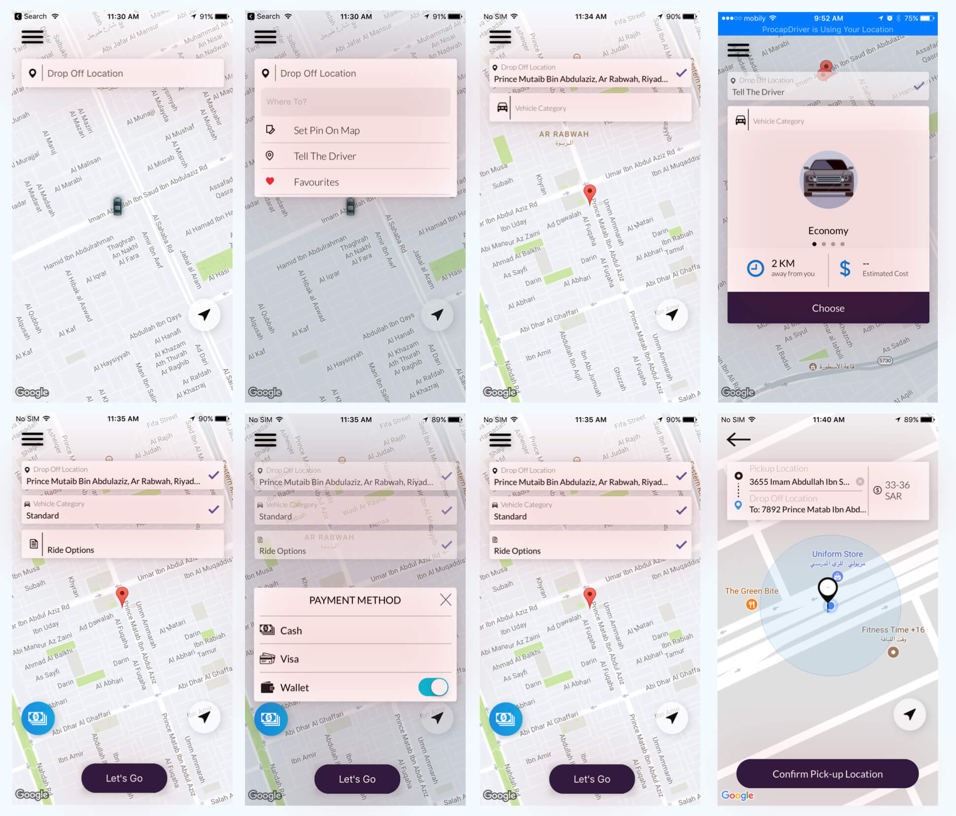
The old design/experience to request driver in the app
Understanding the Flows
To design a solution, you need to understand the problem first and break the journey into smaller parts and analyze each one of them. based on my own experience with the ride-sharing and insight from the competitive review, We should map out the customer journey to dig down deep into every single stage and figure out all the emotional states in the user’s mind
But first, let’s break the journey into smaller parts and analyze each one of them.
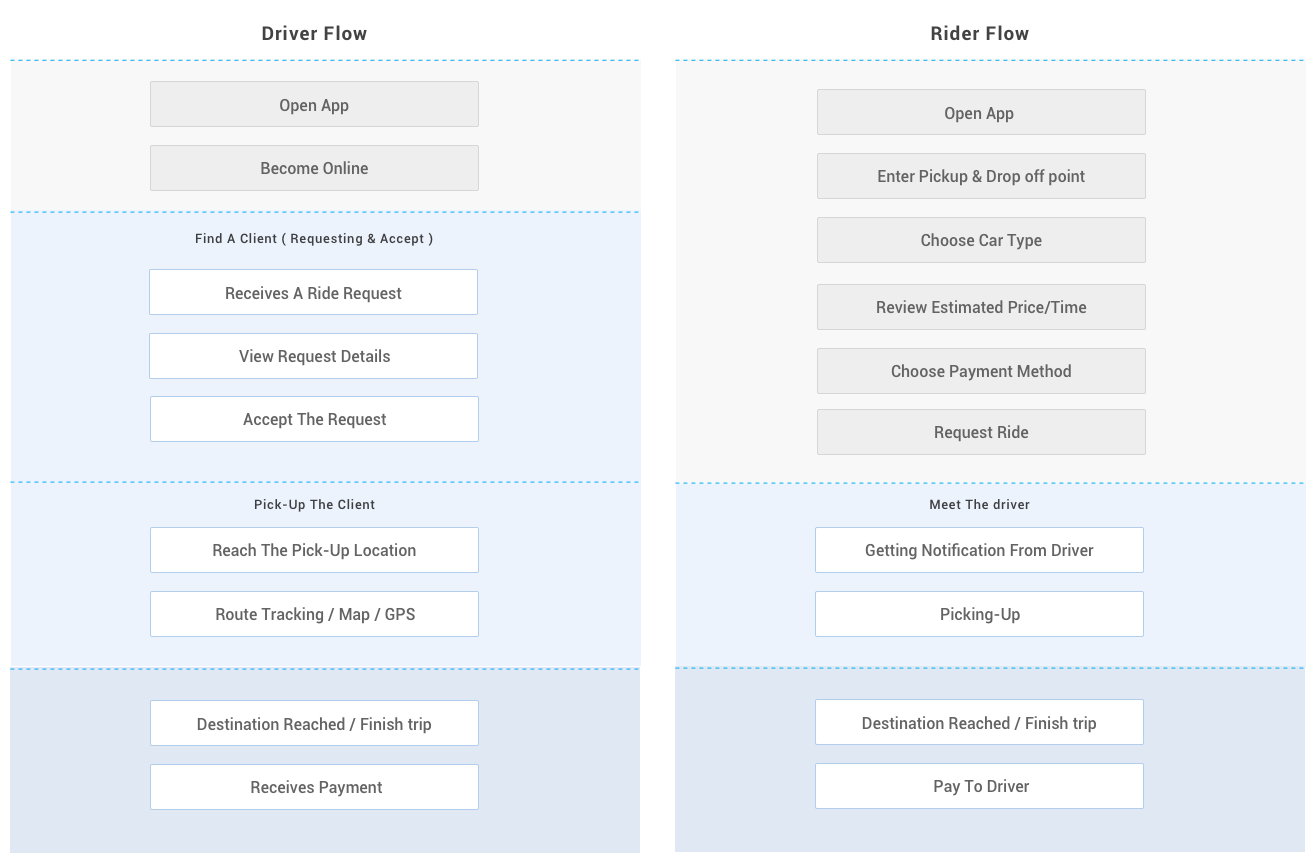
Brainstorming & Require Elements
Revamping and designing a new feature in application like our app requires a lot of brainstorms not only the design side but how we would introduce this new flow to users.
The fact is that the driver wants more info and the rider want less input, This is it. This is the secret recipe for creating perfect interaction screens for both of them.

Fonts & Color Combinations
One of the main challenges that I faced at the beginning of the project that how I choose the correct color for the new identity -There was no new identity that they have- So, I decided to use my intuition. Every designer gets a gut feeling of what feels right and what feels wrong. It changes from person to person.
But of course, there’s a learning curve to everything. I was a shitty designer once. Even now I don’t think I’m there yet. There’s so much to learn and there’s a whole life ahead waiting to enhance this curve.
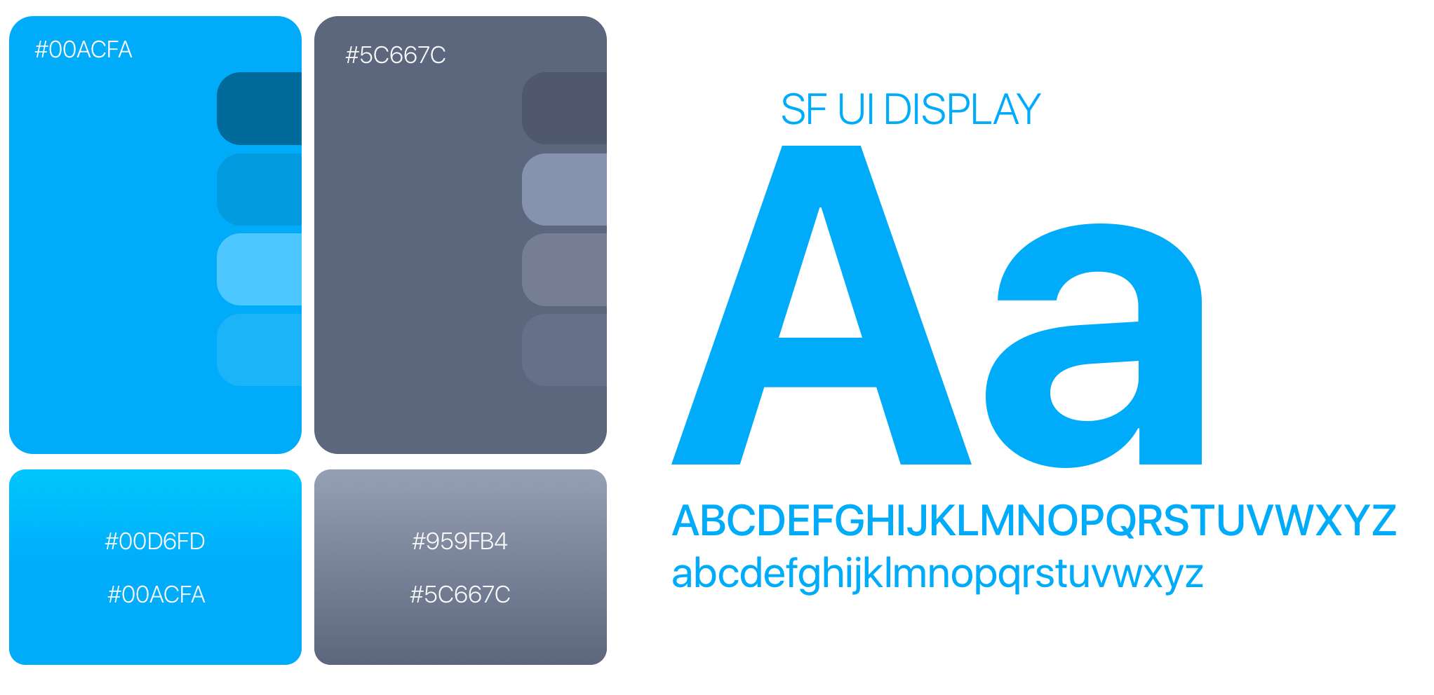
The First Impression
It’s all about the first look, so I decided to take Saudi Arabia's symbols very seriously and use them as illustrations and add a strong culture scent to the login screen. People would like to see something being familiar with their culture to be proud more with the product.

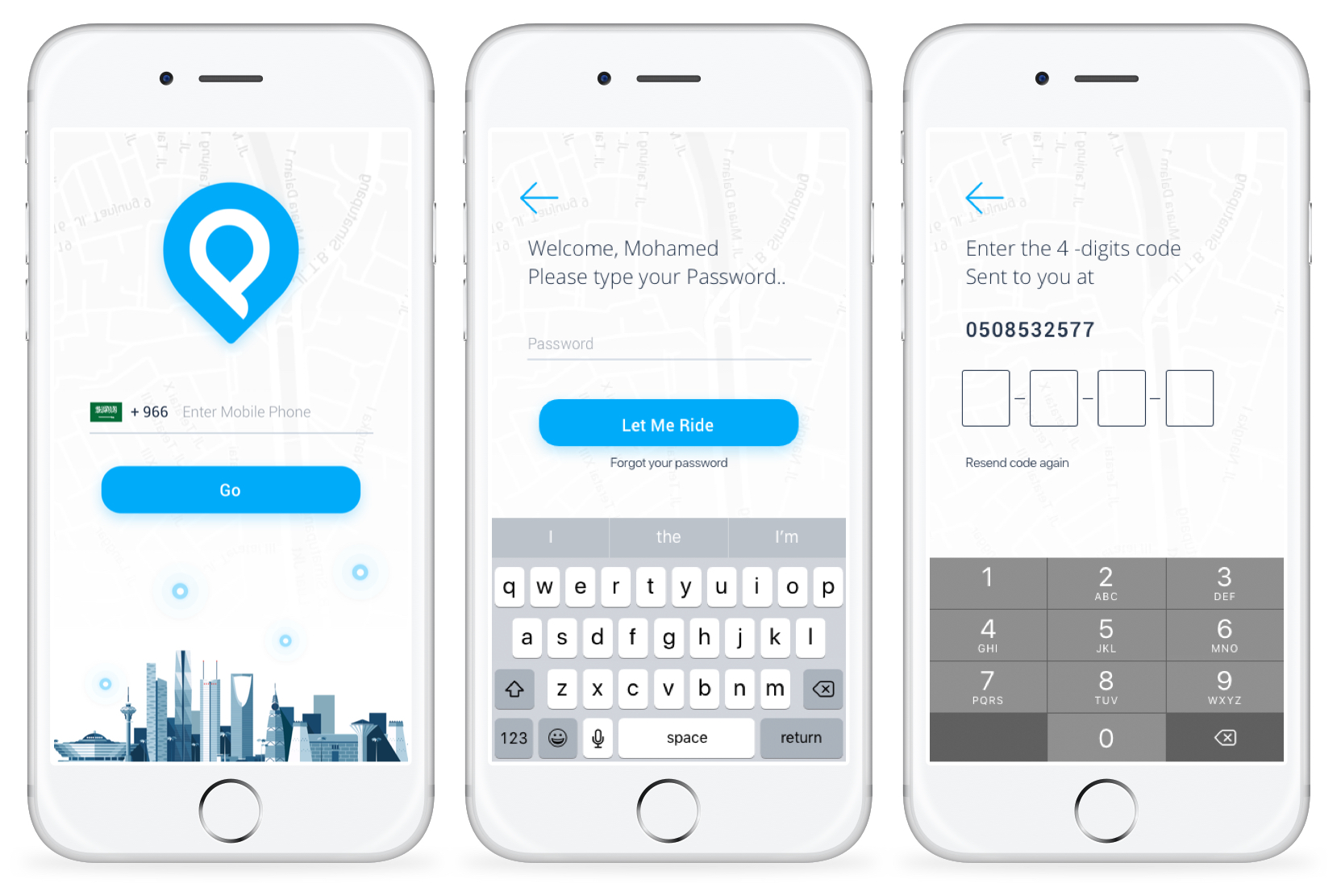
The new login screen
Usable drop-off list with more option
If you think about it for a moment you will find 90% of your next Uber or lyft trips it will be to a recent place that you already visited before ( Work, Home, School,..etc), Actually, we know your daily routine and the places that you head to or back from on a daily basis. So adding recent places as a list make it a sense.
Besides that, Everybody has his favorite places, We will let you put those places on a favorite list to able you get your destination by a single tap.
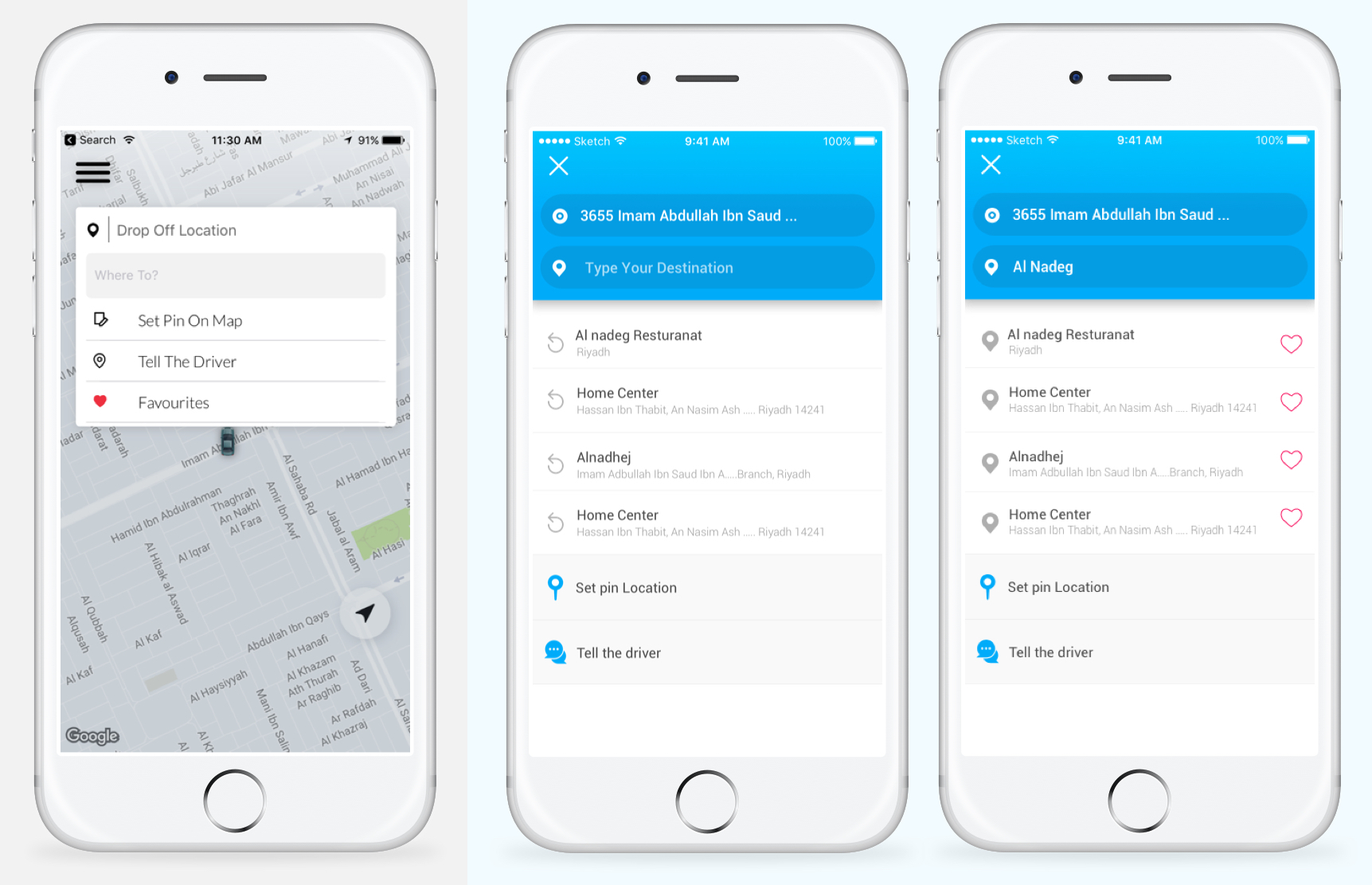
The old and new search location screen
Select Car Type Experience
I completely changed the way of choosing the care type with estimated cost/price, From a boring dropdown list to a card list, It's taken many iterations but in the end, there is no perfect experience, but there is usable experience.
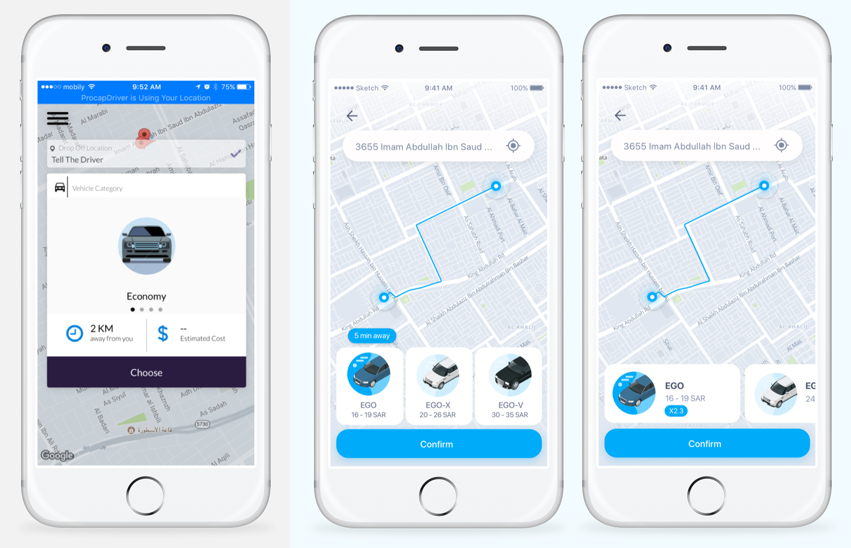
The old and new car type select
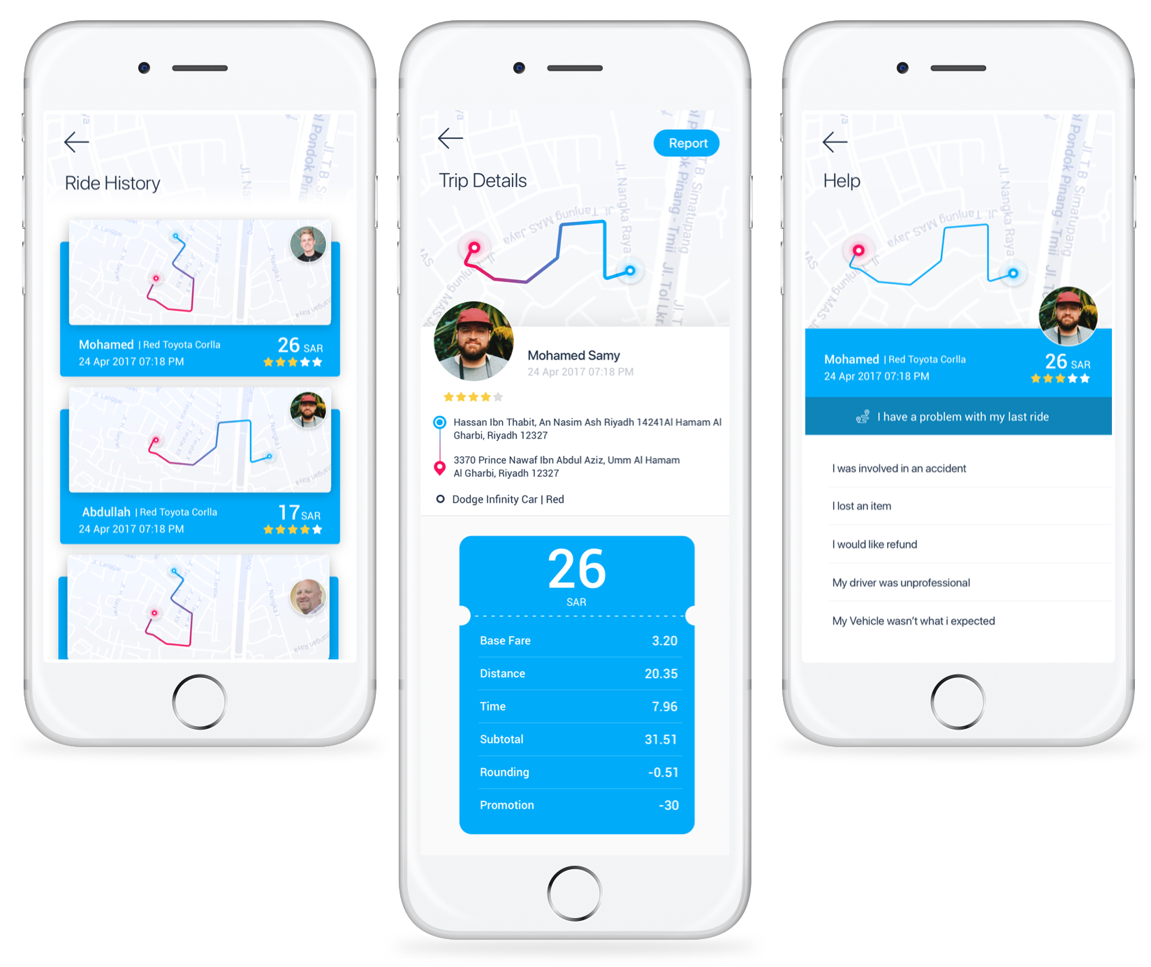
Ride history & Trip details
in the trip history, I focused to show up the important information to the user such as the thumbnail of the road, driver name, time & date, and the total cost of the trip. In the details page, I was inspired by the bill view I find it more flexible and can be added or remove any new records without affecting the overall design.
Making the report action in the top right corner as the main call to actions will be able the people felt more trusting because they can report this trip when they really need it.
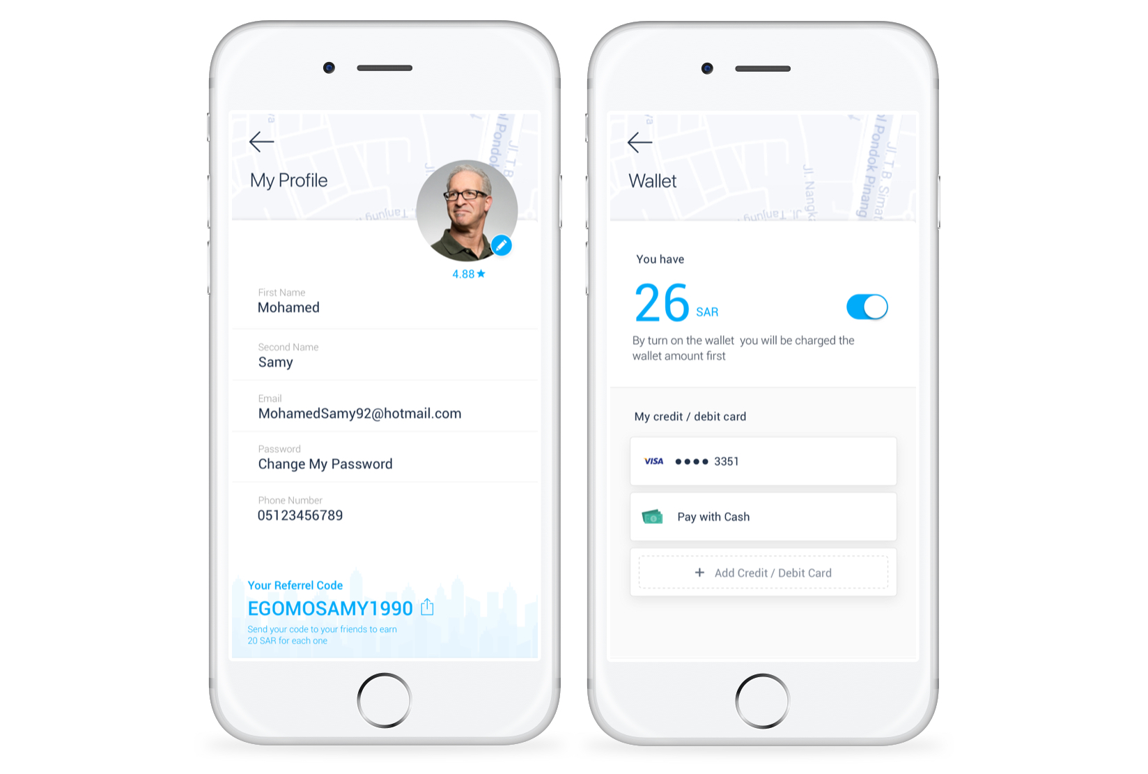
Profile & Wallet View
When it comes to the profile or payments page nothing better than white space to clarity. The app has a wallet feature that you can recharge it with credit or points and use it on the trip.
Conclusion
Acting as a product designer for 3 months outside my home country and living in a different culture gave me more confidence and trust, I think It was a good opportunity to enhance and improve my UX skills especially in a large project like this one.
Takeaways
- Organizing and structuring design principles are just as important as creating them in the first place.
- A/B testing and validate the iterations are important more than hurry up the launching date.
- If you don’t have a UX research team yet, build one or become a researcher!
- Never ever work in KSA especially in Al Riyadh city.
