
Rebuilding a Saudi ride-hailing app's identity and flows
A full-time redesign of an existing ride-hailing app, previously called Easy Trip, rebuilt end to end as Ego: new visual identity, new request-a-ride flow, and new rider and driver screens.
ROLE
UI/UX Designer,
Full-time
PRODUCT
Ego, formerly Easy Trip
Saudi Arabia
MY PART
End-to-end: research, identity,
Flows, Hi-fi screens
Overview
Moving from a corporate UX role to a small startup's only designer
I was hired full-time by a startup in Saudi Arabia to redesign their ride-hailing app, previously called Easy Trip. I'd been a UX designer at Vodafone Egypt before this; going from a multinational to a small startup was a big shift, but the challenge was too interesting to pass up.
My main task was to bring the app back to life: rebuild the user experience along with a new identity that fit where the company wanted to go. I wasn't able to cover everything from that engagement here, but this case study walks through the core of it.
The problem: people need practical, efficient ways to get around, especially in a market where hiring a personal driver or relying on someone else to drive was still the norm for a large share of the population.
The challenge: The market wasn't waiting. Uber had already invested $3.5 billion in the region, and Careem, the strongest local competitor, had just sold to Uber for $3.1 billion. Easy Trip needed an identity and an experience that could actually compete, and I had to build both without a research team or an existing brand to build from.
Part 01
Diagnosing what wasn't working
This part covers three passes: sizing up where competitors already stood, auditing the existing app screen by screen to find exactly where it broke down, and getting close to the riders and drivers actually living with it. Nothing here was designed yet, the goal was just to understand the problem clearly before touching a screen.
1.1 · Competitive research
Reviewing the competition before deciding where to compete
I downloaded the most popular ride-hailing apps in the city to see where Easy Trip stood: Uber, Careem, and Easy Taxi.
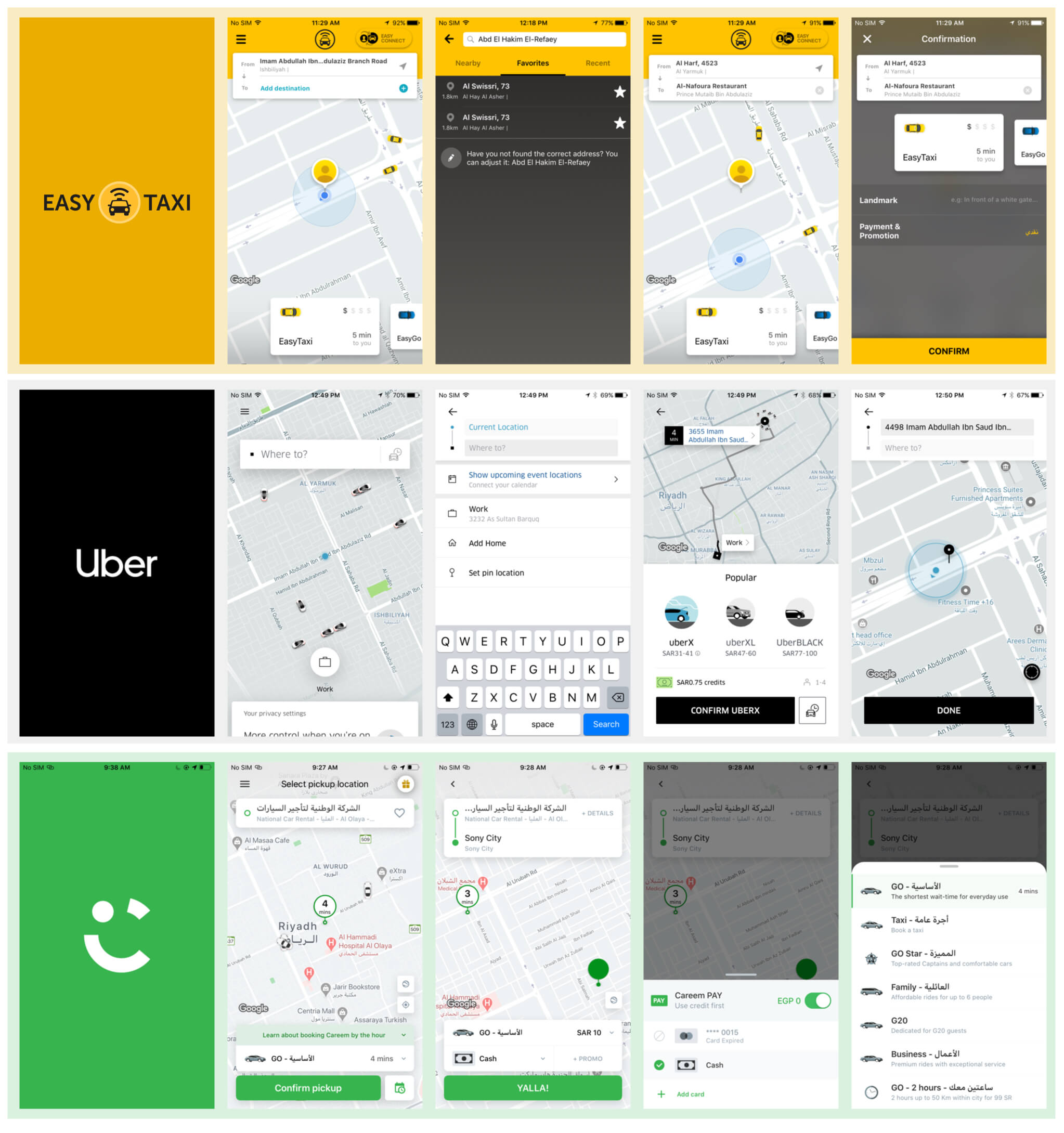
Screens from the three main competitors reviewed: Easy Taxi, Uber, and Careem.
Easy Taxi
Bold yellow branding carried through every screen, with a straightforward, linear request flow.
UBER
A map-first flow: destination search led straight into a keyboard, with minimal chrome around the map itself.
Careem
Full Arabic-language support throughout, with a friendly green identity and a simple pickup-and-confirm flow.
1.2 · Auditing the existing app
Using the current app as the baseline instead of starting from a blank screen
Going screen by screen through the existing request-a-ride flow, three problems stood out.
- A complex process of request a ride: the process of requesting a ride was very frustrated for the user, It was like a checklist, and you needed to complete all three steps to request a driver. The process was tough for the user to understand.
- Wrong use of colors and the call to action buttons: There is no indicator for the loading states or error states in the app!! Weird?
- Poor representation of the selected option: The contacts between the colors on selected and empty states were so odd for the app; I was confused about what I should do and what I shouldn't when select options.
- No transparency about price or estimated time of arrival: The app broke most of the design principles, But the most one was there is no transparency about the estimated cost of the trip or the time of arrival, which I found annoying.
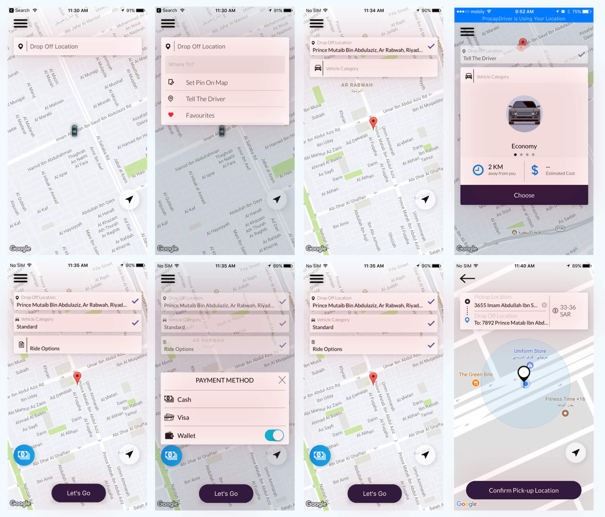
The old design and experience for requesting a driver in the app.
Signal: The existing request flow had no visible feedback for loading or error states, and selected vs. unselected options were nearly indistinguishable.
Decision: Treat the current app as the baseline to improve, not a blank canvas, since a full rebuild wasn't the right call for this project.
Trade-off: Working from the existing base meant staying anchored to information architecture and flow logic that current users already knew, even where I wanted to change it more aggressively.
1.3 · Understanding riders and drivers
Mapping the trip from both sides without a research team
With no dedicated researcher on the team, I split this into two things: pain points in the existing experience, and the competitive field. I rode with drivers ("captains") during regular trips, sitting next to them and writing down their pain points and goals as we went.
I also invited a few riders into the office, had them request a real trip and rate a driver, then gathered their feedback on sticky notes to build out a map of the journey.
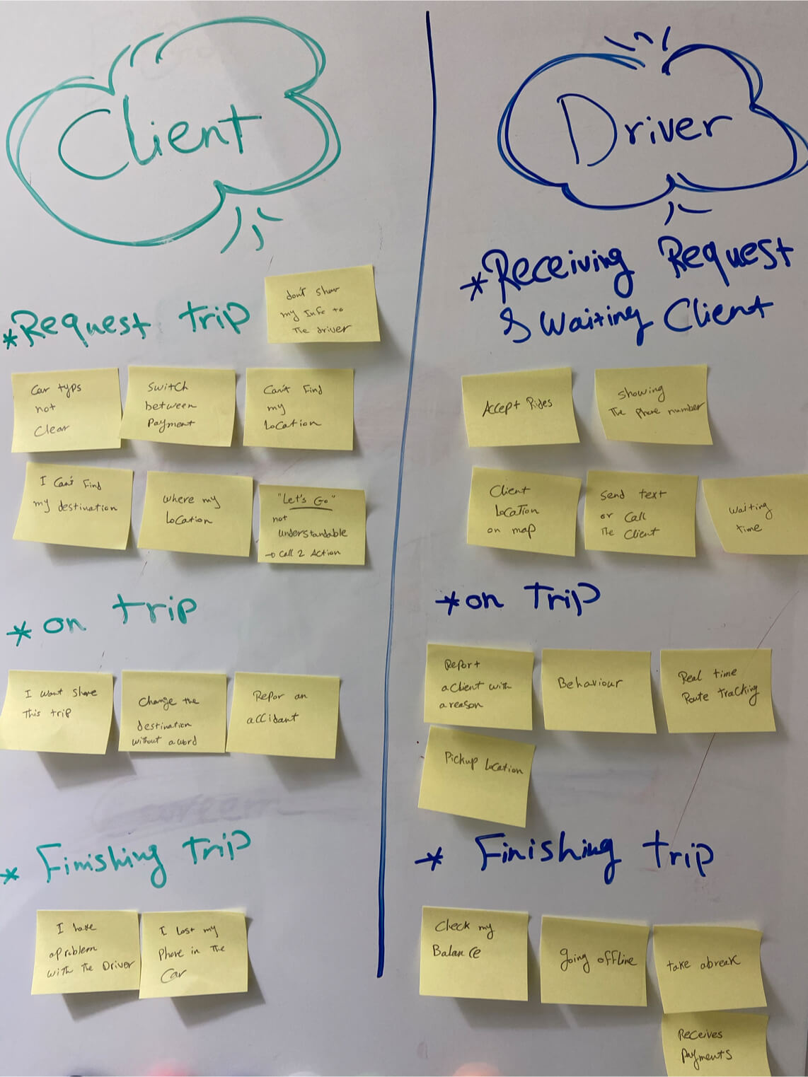
Sticky notes capturing pain points and thoughts from both the driver and the rider side of a trip.
Part 02
Setting the direction
Turned the audit into design principles, mapped both user flows in full, and made the identity call.
2.1 · Design requirements
Turning what I'd learned into guiding principles
Thinking about what a rider or driver would need at different moments, I used these four requirements as guardrails for every decision that followed.
Make it simple
Aim for a simple, sleek design for both requesting and receiving a ride.
Care about safety
Give riders full details about the driver, the car, and the rating before they step into a car.
Pay attention to the details
Know the rider's daily routine and the places they head to, and design around those touchpoints.
Make it crystal clear
There's rarely enough user education built in, so both riders and drivers need to know exactly how much data is being shown to the other side.
2.2 · Mapping both flows
Breaking the driver and rider journeys into stages
Before designing anything, I mapped the driver flow and the rider flow side by side, so I could see exactly where each stage of a trip needed its own screen and its own state.
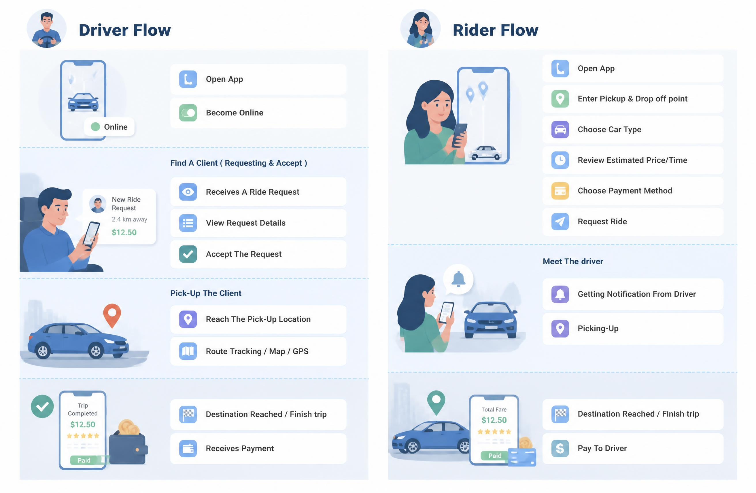
Driver and rider flows mapped side by side, broken into four matching stages: onboarding, requesting, pickup, and finish.
2.3 · Visual identity
Building a full identity system around one mark and one signal colour
One of the earliest challenges had nothing to do with screens at all: there was no existing identity to design around.
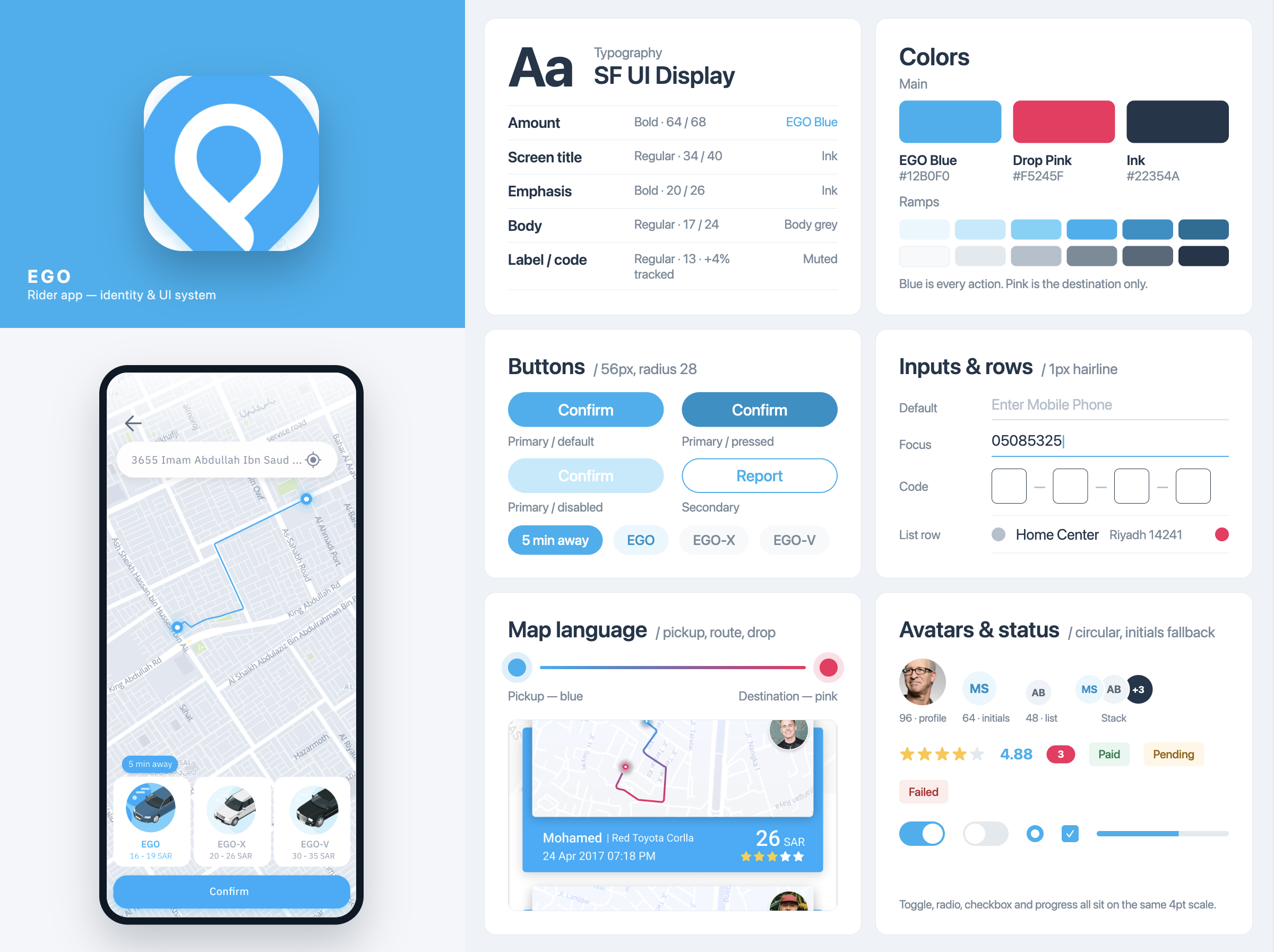
The identity system came together before any screen was drawn: one signal colour for anything a rider can tap, a second colour reserved for wayfinding, and a mark built from the pin itself. The pin was already doing four jobs in the interface, pickup dot, destination marker, saved place, and route end, so using it as the logo kept the mark part of the product rather than a badge sitting on top of it. Pink stayed reserved for destinations and saved places specifically, so it never competes with blue for a rider's attention.
Symbols of the Kingdom
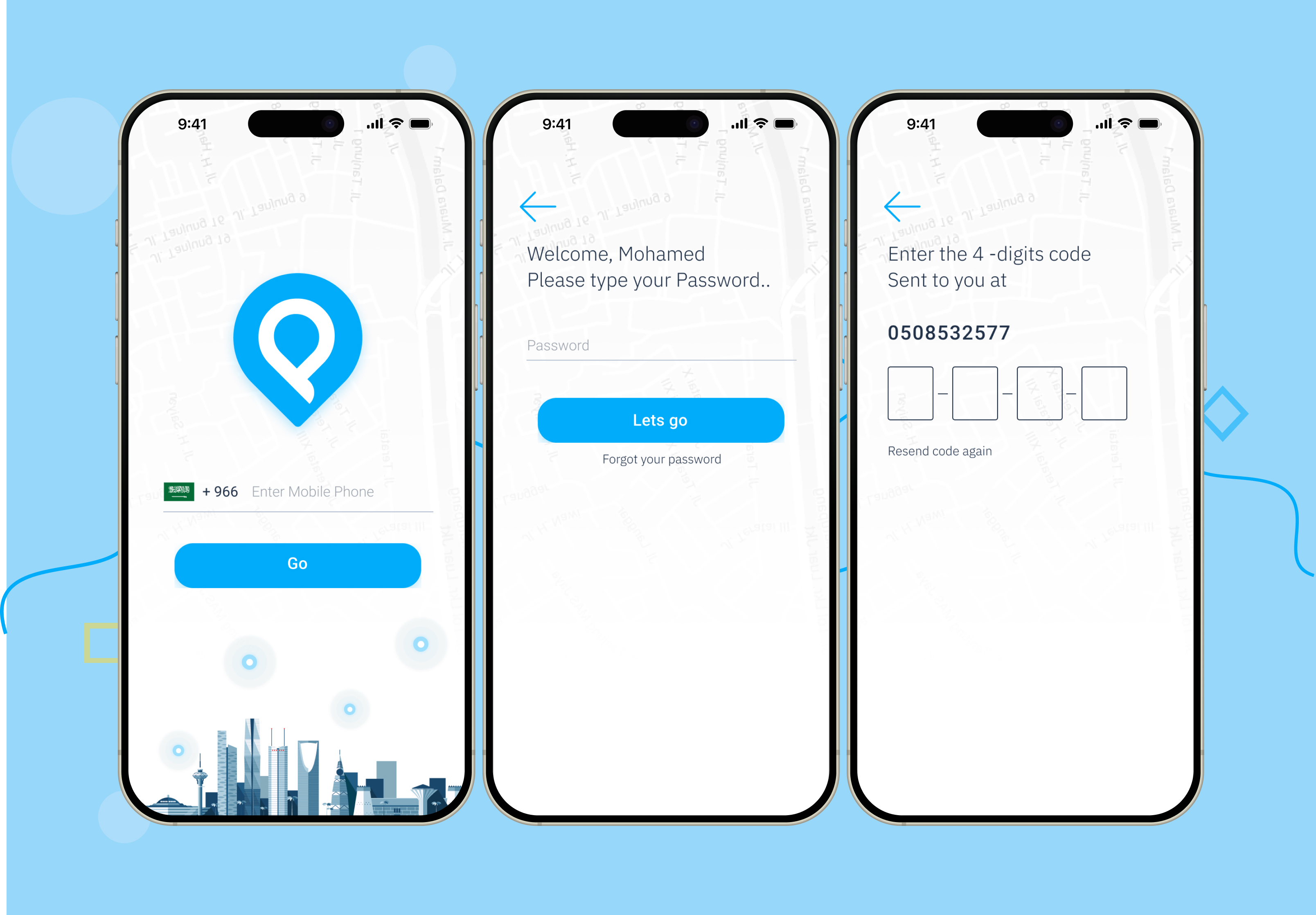
It’s all about the first look, so I decided to take Saudi Arabia's symbols very seriously and use them as illustrations and add a strong culture scent to the login screen.

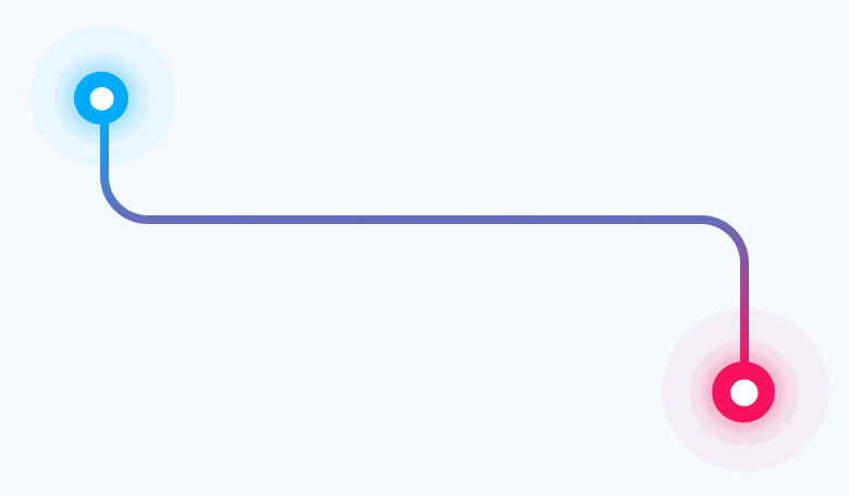
Two ends, two colours
A route has a start and an end, so pickup stays blue and the destination stays pink rather than making a rider read labels to tell them apart. On completed trips the line fades from pink to blue, legible even in a small history thumbnail.
3.1 · First impression
Grounding the login screen in local culture
The first screen a rider sees sets the tone for everything after it. I used a Saudi skyline illustration on the login screen so the product felt familiar and locally grounded from the first tap, rather than a generic template dropped into the market.
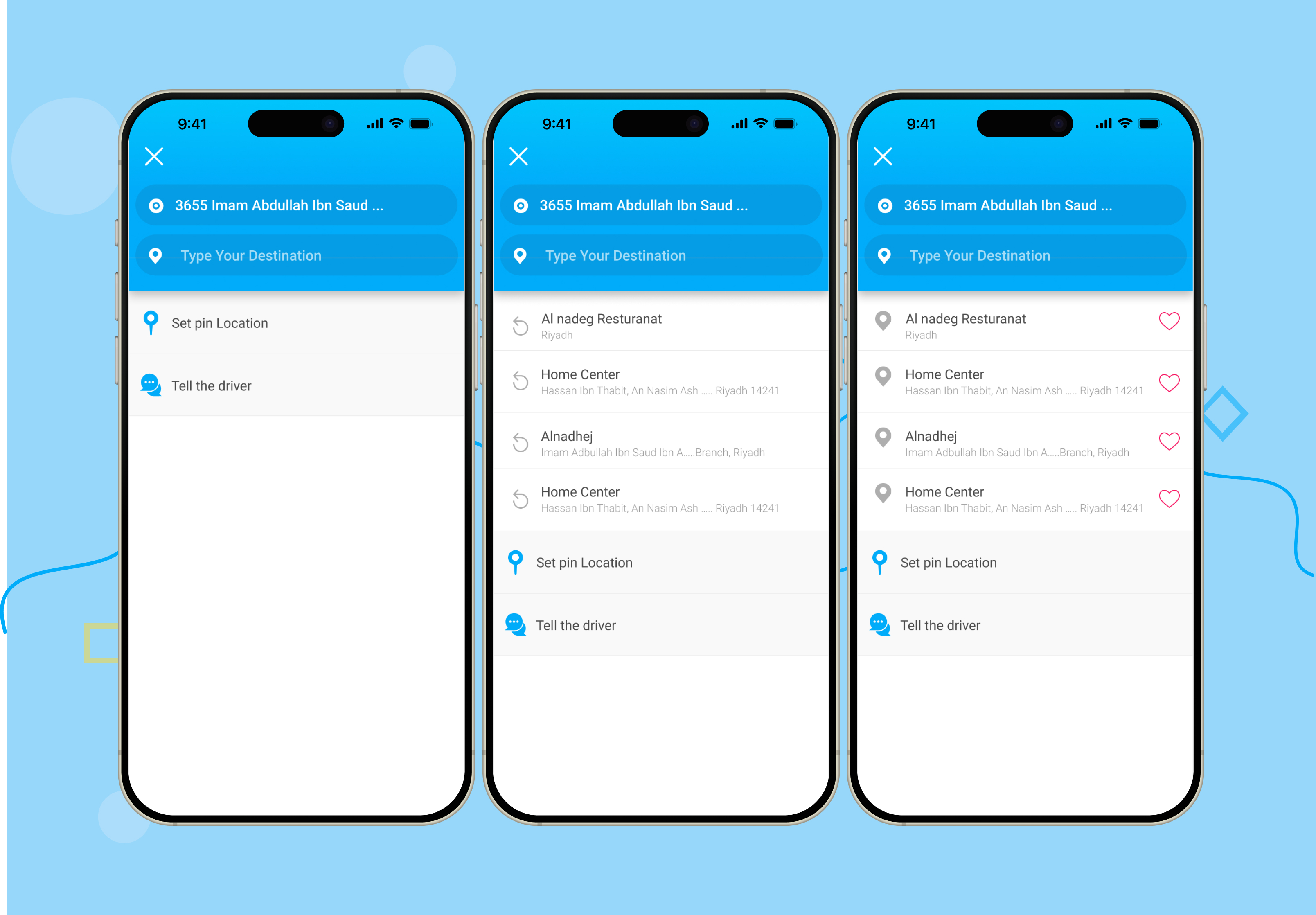
3.2 · Destination search
Adding a usable drop-off list instead of a blank search field
Most repeat trips go to a small set of familiar places: work, home, school.
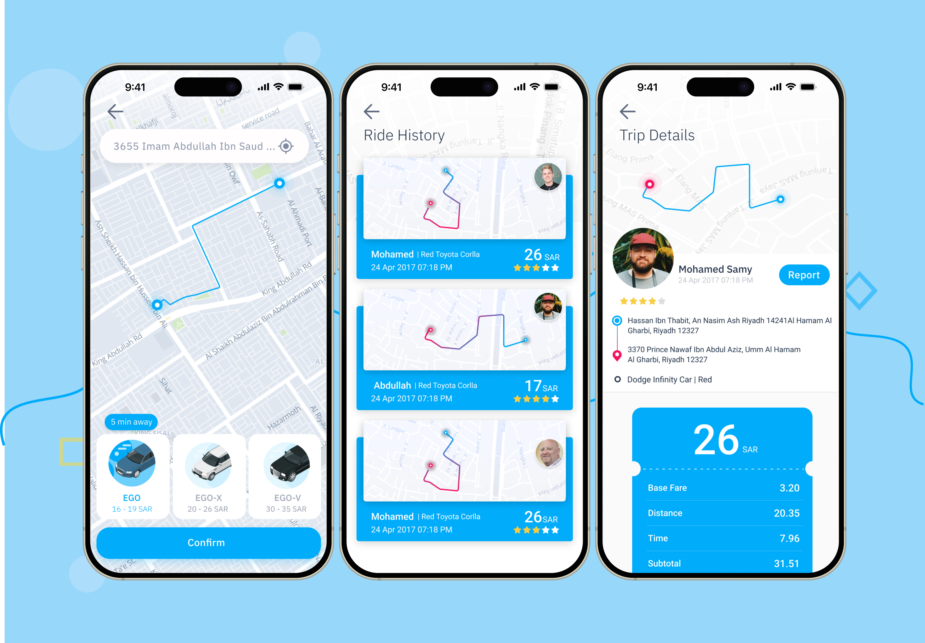
3.3 · Choosing a ride
Refining trip details into something closer to a real receipt
For ride history and trip details, I kept what a rider actually needs afterward: route thumbnail, driver name, date, and total cost. The details screen borrows a paper-bill layout, so line items can change without breaking it, and "report a trip" sits as a clear secondary action.
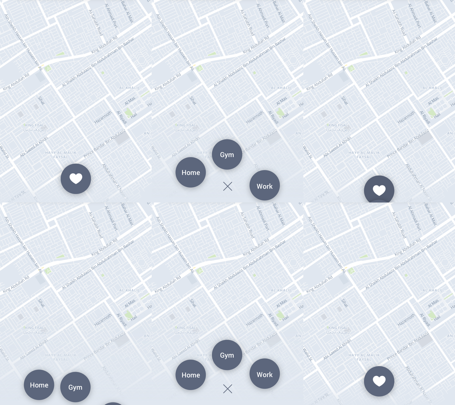
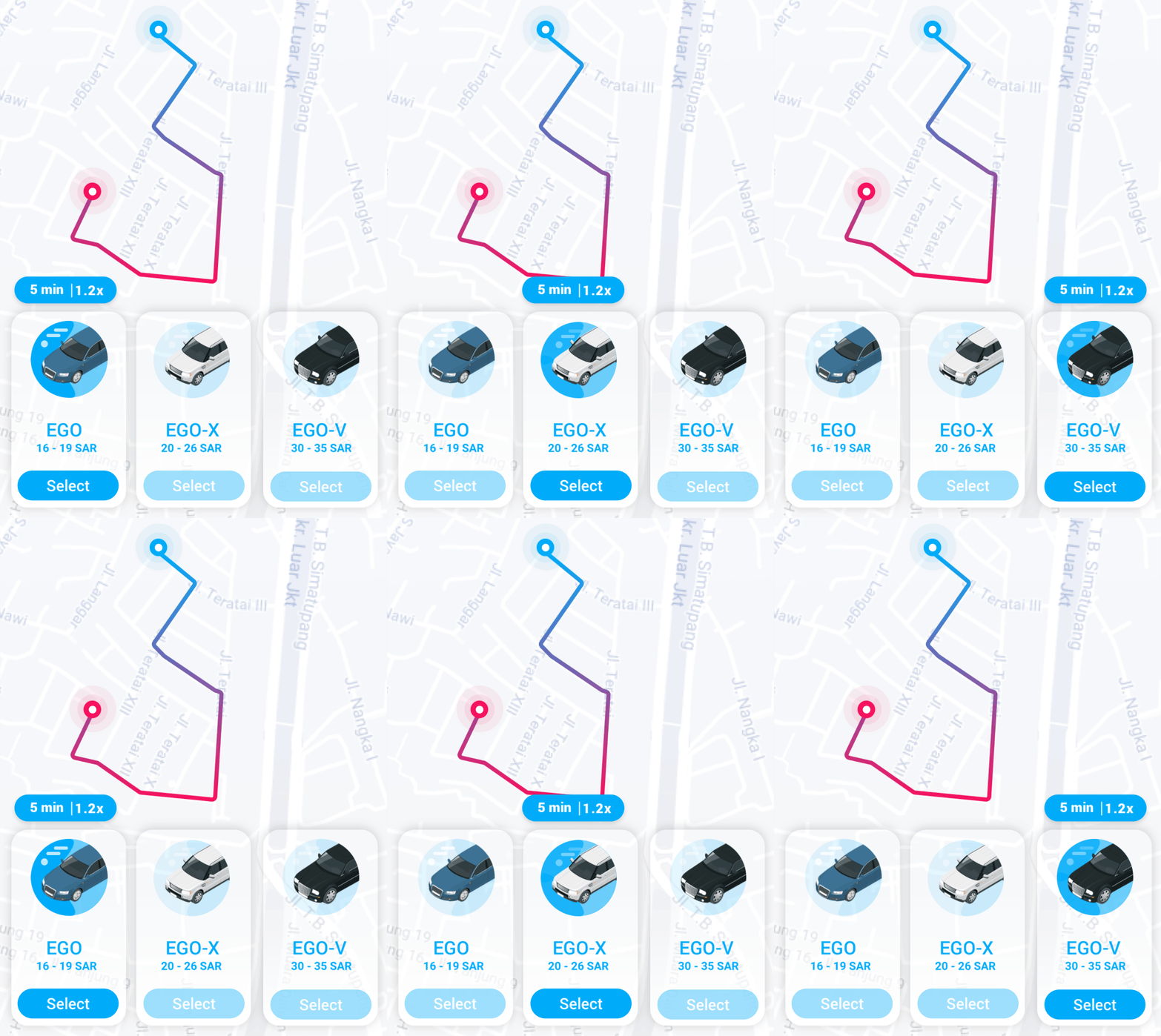
Prototype & Interaction
A couple of later prototypes exploring interaction, not documentation of what shipped: how saved destinations could surface as tap targets on the map, and how car options could sit directly against a live route line.
4.1 · Profile and wallet
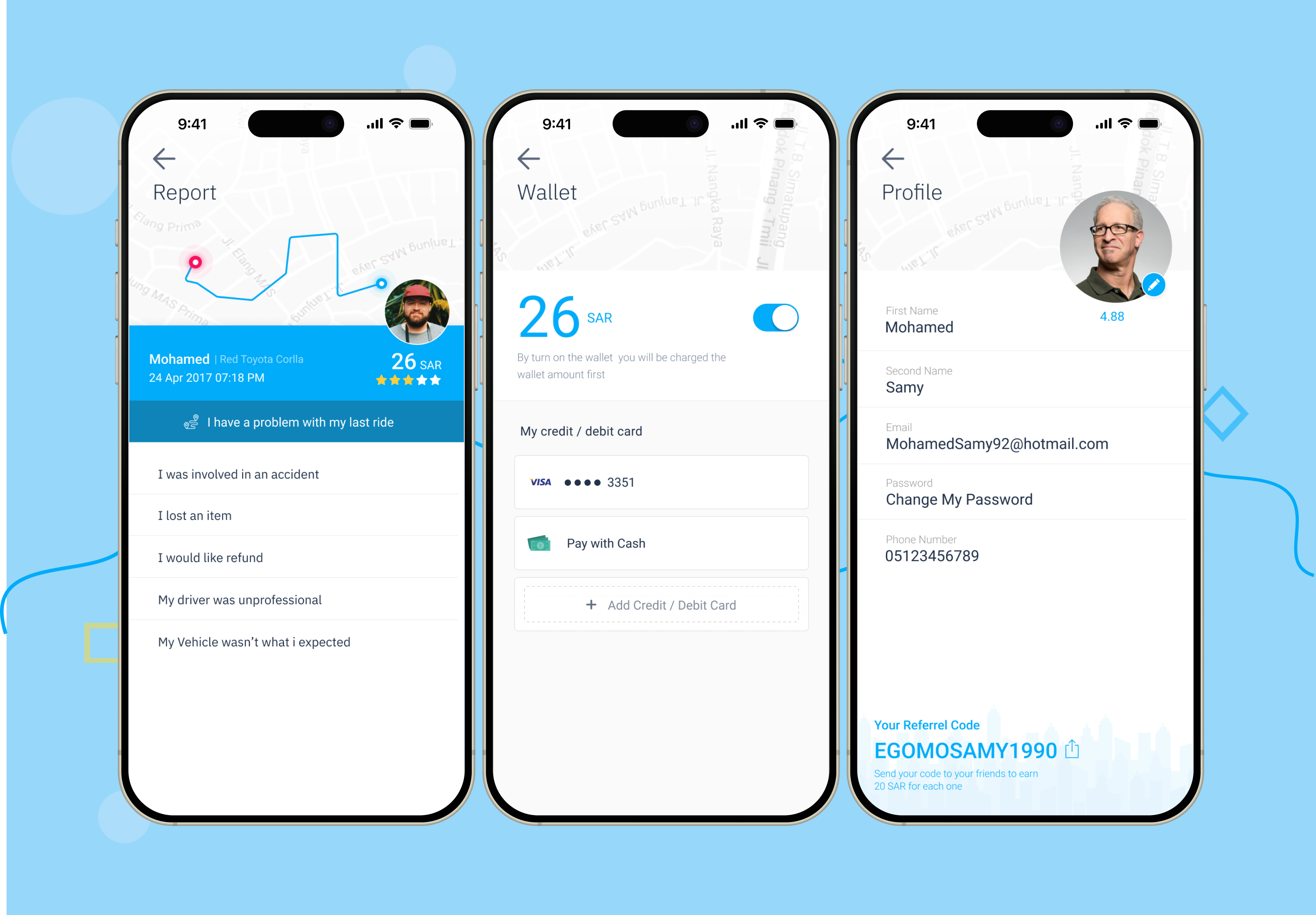
Giving payments and account details room to breathe
For the profile and wallet screens, I leaned on white space rather than dense fields. The wallet feature lets a rider top up with credit or points and use it directly on a trip.
5.· Honest status
Staying upfront about where this stands
I spent three months working on this project on-site in Saudi Arabia, away from home, which was as much a personal stretch as a professional one. It built real confidence and gave me room to grow my UX skills on a project of a scale I hadn't handled before.
Two things I'd change if I did this again: organizing and structuring the design principles matters as much as coming up with them in the first place, and A/B testing and validating iterations deserves more time than rushing toward a launch date. If you don't have a dedicated UX researcher on a project like this, the honest fallback is to become one yourself for the duration.