elmenus - Delivery Courier App
Creating a delivery courier app for Cairo-based food discovery and
ordering platform "elmenus" - UX case study.
This was a solo passion project, where I did research,
Ideation, sketching, and the high-fidelity design.
I was working as a part-time basis last year in a startup located in Egypt to enhance and improve their app, they have a food discovering platform & food ordering app called "elmenus", the app was already launched and working perfectly but they have more extra features need to build.
Overview About elmenus
elmenus is a food discovery platform that helps people discover and order the food they will love. They answer the global existential question of “What will I eat today?”.
For the past 7 years, elmenus has become the leading food discovery platform in Egypt by providing over one million users every month with comprehensive restaurant information for over 8,000 restaurants including their menus, reviews, food photos.
Besides, elmenus has enabled users to order their food online since September 2018 with great traction as now users can decide and then get their food delivered in the quickest way possible.
The Challenge
The task was so simple; We need to create a fleet app/ delivery app for our courier's " in-house fleet App" like UberEats or Deliveroo. An app we can complete the delivery ecosystem with to delivering more orders to effectively serve over 1 million users across Cairo and offer a complete dining experience.
Here is a rough outline of how the app should look like:
- Customer orders food delivery through the elmenus app.
- The request goes to our couriers, and he decides if he wants to take up the job - most of the cases, he will accept the job.
- Once the driver accepts the order, he will have to go to the restaurant to pick up the food. After picking up the food, the driver will have to deliver the food to where the customer is.
*Update: The app is live now, Check it out on the Play store
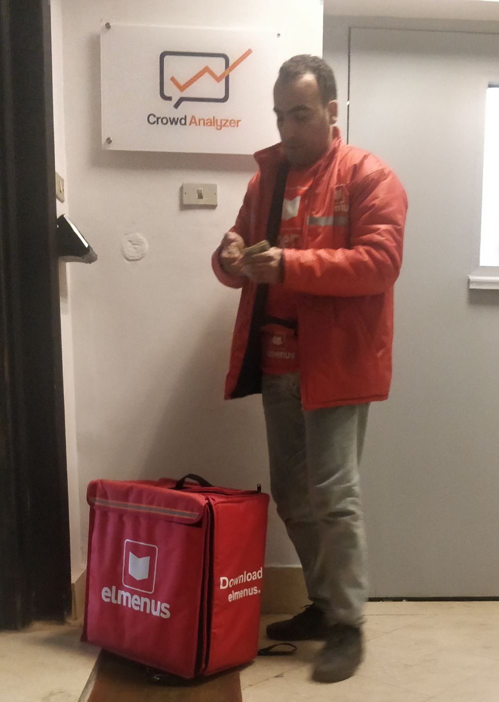
** Update: I submitted my lunch order and it's delivered by the fleet.
The food delivery ecosystem / Target audience
In order to understand what I need to build and how the process works, I did a simple map to show who the people are, why they are there, and the relations between them. Of course, the most important part of this challenge is the delivery guy whatever he owns a car or a motorcycle, or even a bike.
Customer: our customers are the trigger of the process, they are using our app to order thousands of orders per day 24/7 days and we do our best and provide a usable process in the app in order to make their experience as frictionless as possible.
Restaurant: The main partners of elmenus. We provide tools and services that make their experience as frictionless as possible. They are receiving the order via elmenus Merchant tablet and start preparing the meals and update the status of it continuously.
Drivers ( Main persona ): who are also the partners of elmenus, they are the main persona here, So I need to create an experience that fits their need to receive, Approve, and deliver the order with no mistake and without frustration.
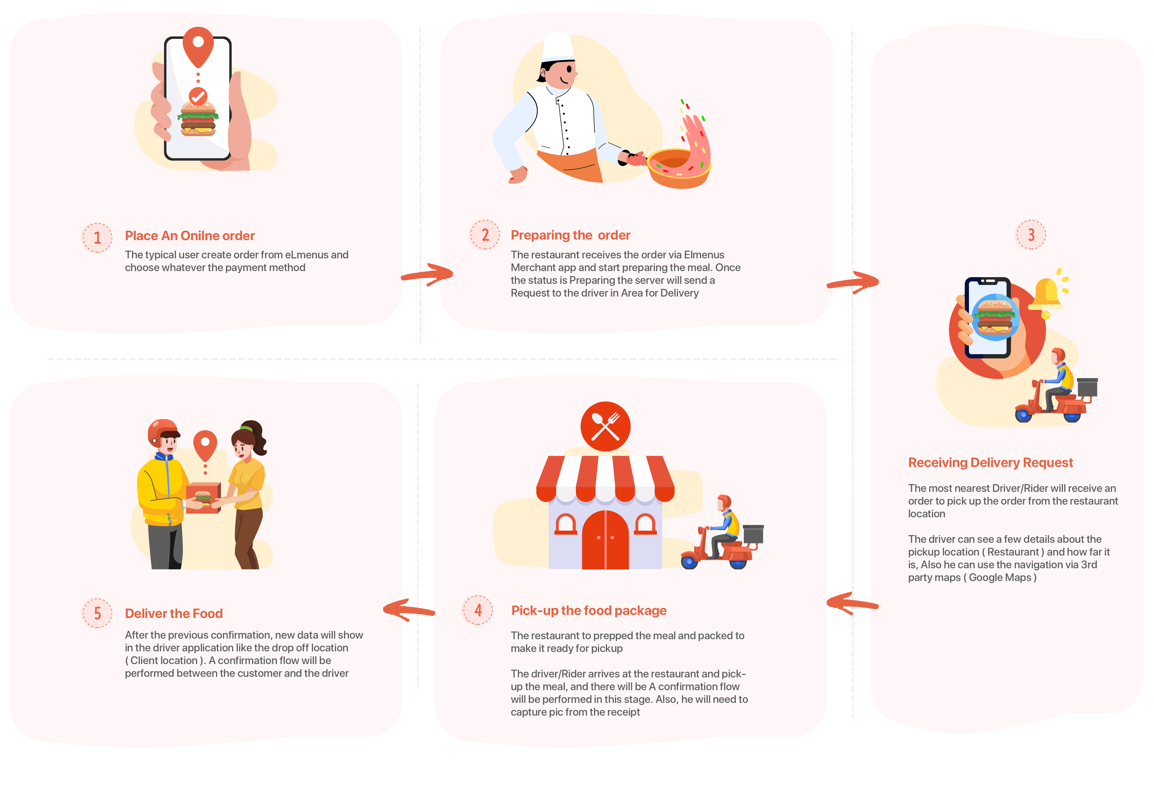
Bird’s Eye View User Flow
My design process
I'm always a big fan of User-Centered Design. It’s all about the user - the driver in our case - and about his needs, So I defined a few steps that should guide me to create something usable and people love.

Contexts
There is so much missing data about the context, And it is better to understand the context on where/when/how the app will be used to define the challenge and the clearly needs.
Who: Only the verified driver by the agency (third-party), Most of them have experience in food delivery, working on shift bases most probably with UberEats - and others have no experience.
How: Using only cheap android phones and most probably with 3g coverage.
Where: The app will be used while riding to different pick-up and delivery locations on their motorbikes in order to get more accurate instructions and to be able to update the status.
Discover & Understanding the user
For sure the discovering and understand users need more resources - UX researches - and suitable budgets, unfortunately, I didn't have both. Actually, there is no need to re-invent the wheel from the beginning, there are a lot of platforms up and running perfectly so my decision is to go with "Observation ".
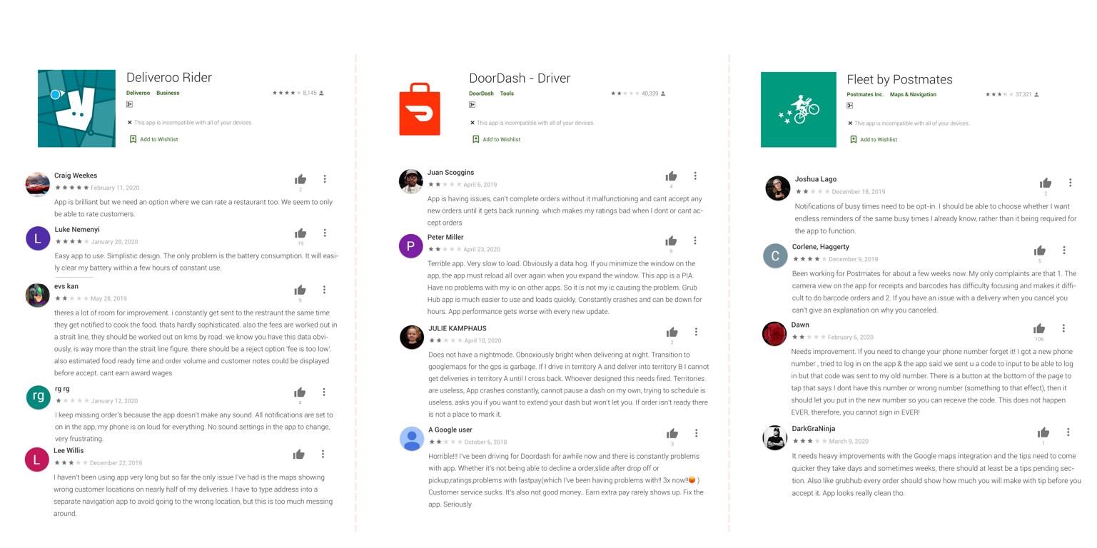
1- Gathering User Feedback There are so many food delivery apps in the world and all of them succeeded in their regions - Ubereats, Deliveroo, DoorDash - and for sure they have magnificent apps with a usable experience for their own drivers. With my few resources, I began my research by starting to look at similar platforms, I went online to check people’s feedback and tried to find what are the strongest and weaknesses points they have. Here are some examples of feedback:
2- Training Videos on Youtube Another resource that I used, Youtube has so many videos about the onboarding and training videos for the courier apps like ( Deliveroo, DoorDash, and Ubereats ).
Watching these videos help me to empathize more with the user flow and make me understand more the context of the situation and bring some potential challenges or needs users may have.
How to use Doordash, UberEats & Deliveroo apps step by step
3- Collaborate with PM & Delivery Fleet Manager After the user reviews and Youtube training videos, Obviously, it's time to make some collaboration. Setting down with the " Product Manager " & " Delivery fleet manager, Likely he was an Ex Glovo delivery fleet manager by the way".
I always prefer or I think that It is a good idea to appoint the Product designer to work together with the product manager. for several reasons one of them is, the product manager is a representative of the business in the company, that is means the company goals are as important as the needs of the user.
In theory, a unified perspective is good “ I mean the design perspective”, but it doesn't really work in real life. The truth is that you need more perspective to solve the problem and satisfy both users and company goals
Define The Problems
After a lot of discussions and going through the user reviews, various contextual situations, and interviewed the fleet manager, I assume the following are some of the pain points I can tackle in order to elevate the end-to-end user experience.
Too many confirmations: it was obvious there are too many confirmations required from the driver ( arrived at the restaurant, Picked up the item, on my way, etc ), there is a call to action for every single movement that the driver makes. It was a very frustrating thing for the driver especially when he drives.
An old device with low GB Ram and perform on low-speed networks: the main persona - a shift bases driver - have low incomes and for the sake of technology limited and the weak infrastructure of telecoms network in the country, We assume the driver will use the cheap android device and 3g connections for most of the time.
Geographic distribution: Our solution will be based on time-shifts and order bonuses. So we need to make sure that the driver is in the right place and ready to receive orders.
GPS accuracy: a cheap device will give you a cheap GPS chip which will reflect on the accuracy, So we need to reduce the use of CTA based on GPS locations and switch to be automatic ( Set a radius or range might be a solution ).
User Journey & prioritization
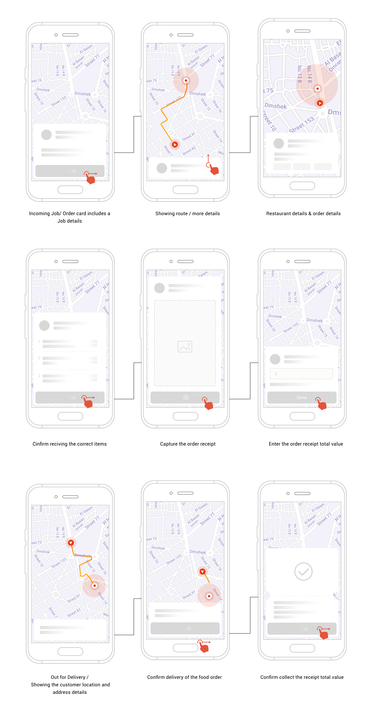
The goal of creating the user journey is to understand how to operate the app in order to accept and complete the jobs, I split up the experience into six stages/parts, each one of them has its own requirements and challenges. The flow starting with opening the app and waiting inside the hotspot in your area:

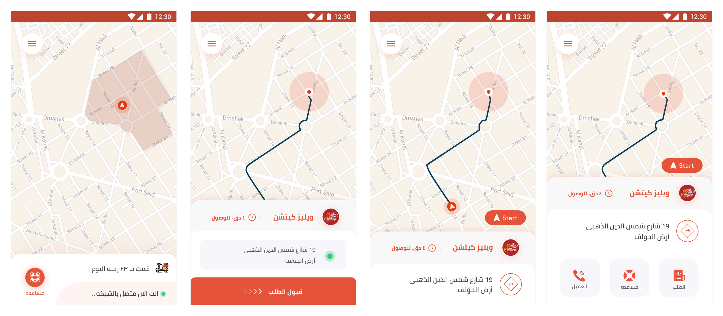
- Accept job: Accepting the incoming request for a new order through some sort of alerting view having some summary info about the order.
- Arrived at Restaurant: For the sake of reducing the performed call to action, we need to make it an automated process by drawing a radius circle on the google map around the restaurant location, and when the driver being into this circle, the server will get a confirmation that the driver in the restaurant or at least near of it.
- Pick-up The Food: The restaurant be prepped the meal and packed to make it ready for pick-up and the driver arrives at the restaurant and pick-up the meal, A confirmation flow will be performed in this stage. Also, he will need to capture pic from the receipt.
- Out For Delivery: A confirmation action will be performed in this stage by the driver to show the customer info ( Name, Address, and Phone number ).
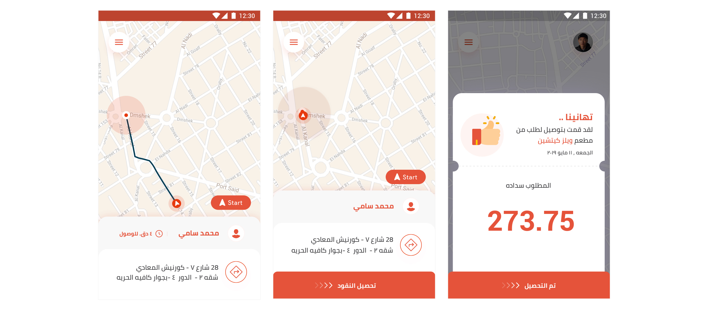
- Arrived at Customer Location: For the sake of reducing the performed call to action, we need to make it an automated process by drawing a radius circle on the google map around the customer location, and when the driver being into this circle, the server will get a confirmation that the driver in the customer or at least near of it.
- Deliver the package: A confirmation will be performed by the driver to inform the server that the order has been delivered.
Ideate And Explore More Solutions
Brainstorming and inspiration is a very important stage for getting out tons of ideas from the brain. Setting with the product manager and the delivery fleet manager gives me a chance to explore more ways to enhance the experience and fix the pain points of the user.
Too many confirmations
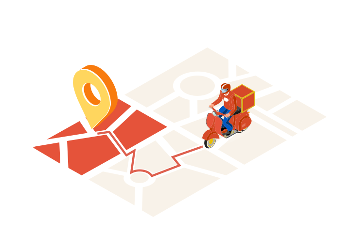
For the sake of reducing the performed call to action, We need to make an automated process by drawing a radius circle/spot on the google map around the restaurant location, and when the driver being into this circle/spot, the server will get a confirmation that the driver in the restaurant or at least near of it.
Geographic distribution:
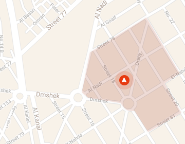
As I mentioned before the solution will be based on time-shifts and order bonuses, for that we need to make sure that the driver is in the right place and ready to receive orders. So, Heat Map will be a perfect solution and be mandatory if the courier needs to be online and receives jobs/orders. only if he existed within the heat map range.
Information Structure
After looking at similar products in the play store, I got some ideas of how the product should look like and how to be structured. So, I designed a simple content structure as a draft of an initial version for the driver.
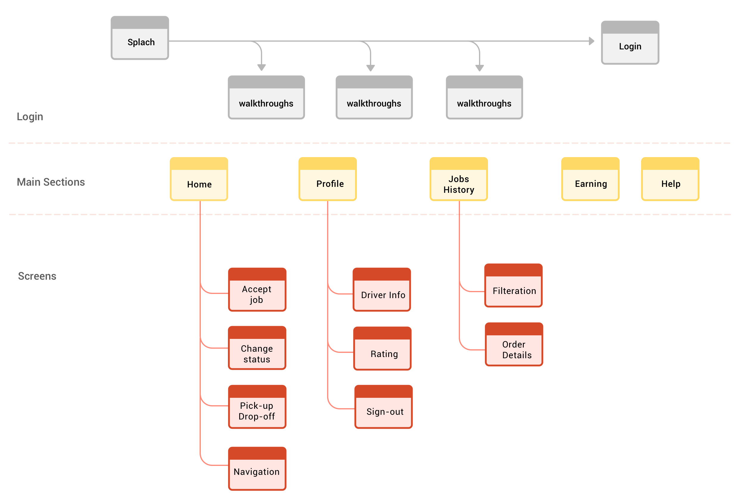
Information architecture of the driver’s app ( Map App )
Wireframe
After I had a better understanding of user behavior and the process, I have listed some key features of the app in order to create high-fidelity wireframes. Wireframes gave me some ideas on how things would look like and made my work for visual design easier.
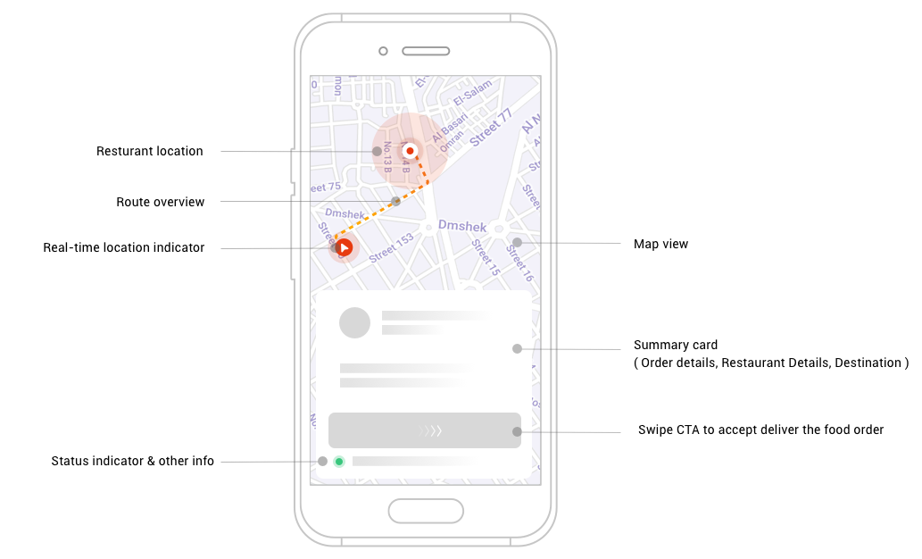
- Status Indicator & other info: This is designed to give the rider a quick indicator of his status online/offline and how many jobs/deliveries he did in the day.
- Swipe CTA: swipe button is among the most important, It gives the driver the access to accept the job and start his journey.
- Summary Card: display essential information to drivers like the restaurant details, estimated fare, estimated time duration to help them make decisions.
- Restaurant location and radius: the idea is to draw a radius circle on the google map around the restaurant location, and when the driver being in this circle, the server will get a confirmation that the driver is in the restaurant or at least near it. No more CTA
High-fidelity Design
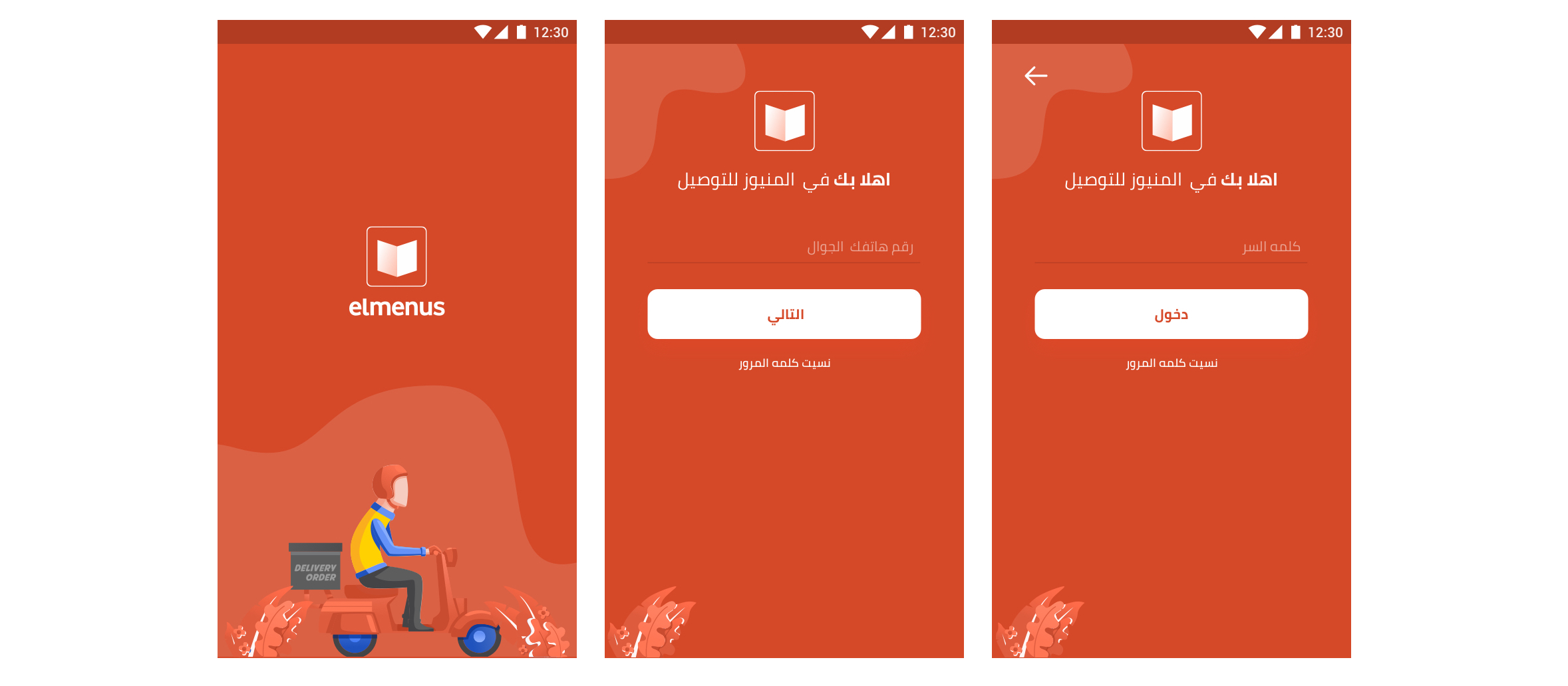
After validating the idea and the flow with the wireframe, It's time to put some colors. I used the main panton and colors of elmenus main app, Using the Roboto font with some different weights for the hierarchy purposes.
#1 Splash & Login Screens
#2 Incoming Request & Pick-up
#3 Drop-off the food
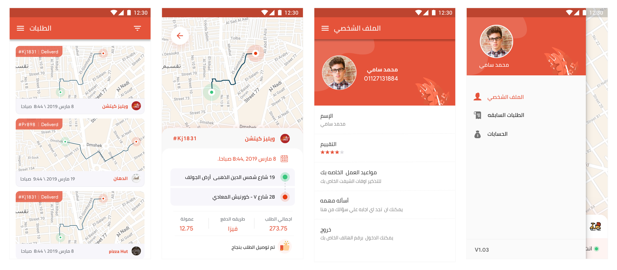
#4 Order History, Profile & Menu
Measure success & Validation
Like always, coming up with a solution doesn’t help much if I don't know to measure its success. and great usability is one of the key factors involved when you want to keep your users engaged and satisfied with your product, now is the time to close the process and decide how I can validate the solution.
Unfortunately, the validation part is classified, but I can tell you about the tool and process, We did like I always prefer conducting Usability Testing, put some KPI's like task completion time and task success rates by make the users do the task scenario that already defined via High-fidelity prototypes.
We got a new investment
" Cairo-based food discovery and ordering platform elmenus has raised $8 million in a Series B round, it announced today in a statement to MENAbytes.
The investment was led by Dubai-based Global Ventures and Cairo-based Algebra Ventures with participation from Tarek Sakr and Hamad Al Homizi, the co-founders of Kuwait’s 4Sale who recently partially exited their startup to NBK Capital. The round takes elmenus’ total raised to date close to $10 million."
Egypt’s Elmenus raises $8 million Series B to expand further into food delivery https://t.co/oCsOSOkYIl pic.twitter.com/2cic3bIo3H
— MENAbytes (@MENAbytes) February 3, 2020
Conclusion
It was so much fun to work on a project such as this one. Working with the elmenus team is a great thing especially when it's come to the team and communication.
